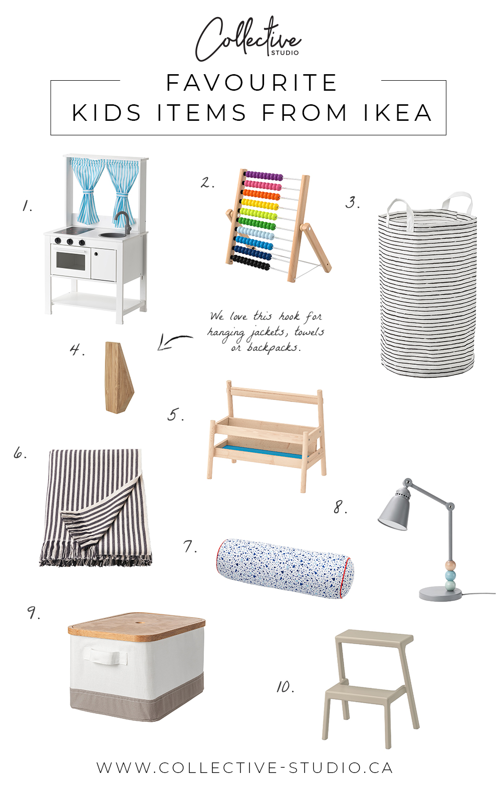
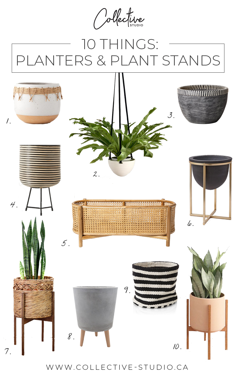


February 22, 2019
Project Helena was unique because the home had been renovated recently before our clients purchased it. The space felt new, but it lacked the personality and warmth that our clients craved. Our job was to help make the house feel like a home – their home.
The house as it was had a lot of hard textures and stark white – not the most family-friendly set-up. The clients are young parents with two kids (both boys!), so we knew our design needed to be functional and casual. We also saw that the home’s original layout wasn’t the best fit for our clients. Our clients truly trusted our vision for this project, which allowed us to make some big changes – we’re so thankful they did, because we couldn’t be happier with how it turned out!
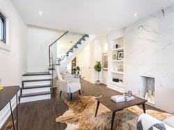
Before: Living Room
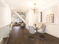
Before: Dining Room
The living room was originally at the front of the house, which is the largest open space on this floor. In this case, the size of the room was working against it. We wanted to make sure we got the most out of every square foot of the house, and we felt that having the living room here was a waste. Plus, it prevented the living room from feeling like the cozy family hang out that our clients wanted (which was less of a formal “living” room and more of a cozy family room / den).
The dining room area was in the centre of the house, just off of the kitchen. While that layout makes sense in theory, it actually made the living room feel even more cut off from the rest of the house.
Since our clients have alley parking, they use the back door much more often than the front. We shifted the layout to reflect this by moving the dining room to the front of the house and shifting the living room towards the back.
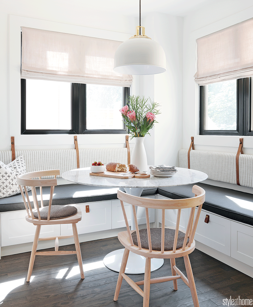
After: Living Room
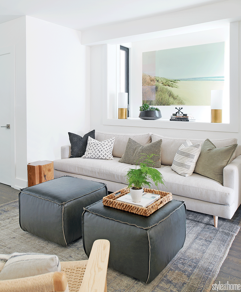
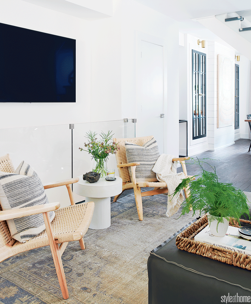
The new living room is right in the centre of the home – which is fitting, because of its close proximity to the kitchen. We made some key decisions to make it functional for use as both a conversation space and a spot for watching TV, like setting the two woven chairs in front of the TV (extra seating for guests) and opting for one long couch pillow (perfect for curling up as a family).
In this room, we were all about adding soft textures and warmth. We went for ottomans instead of a coffee table and added a bright rug to offset the dark floors. The light woven chairs, linen couch, and beachy art (by Christine Flynn – one of our favourite Toronto artists) make the space feel airy and bright. Mounting the TV on the wall (over the stairs down to the basement) was a great space saving design hack – we didn’t need to worry about finding a large console or having the TV become the focal point of the room.
After: Dining Room
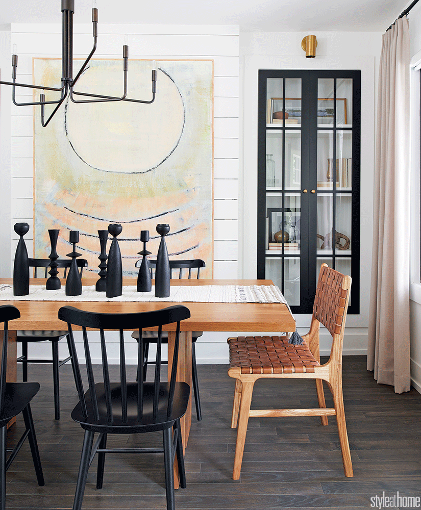
We knew our clients wanted a designated space for entertaining that didn’t feel fussy or overly formal. This dining room ended up being just that. The black accents make it feel pulled together and sleek, while the leather, wood, and linen keep it in line with the rest of the house. The built-in cabinets are great because they double as a storage spot and a way to showcase unique pieces.
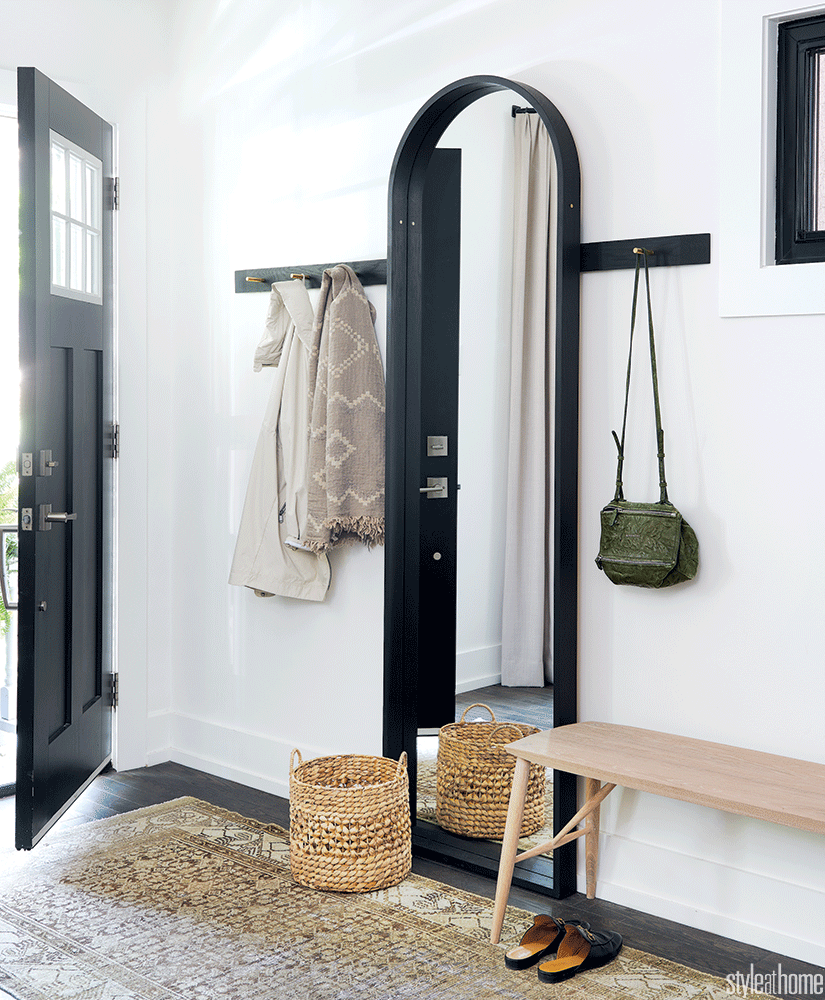
The front entrance also needed to become functional, without taking up too much space or looking messy. We added in a runner to visually section off the space and create a designated entryway. The large mirror makes the whole room feel bigger, while the hooks provide a place to hang guests coats.
Before: Kitchen
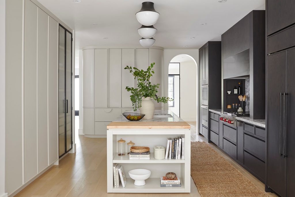
The area behind the kitchen is probably the biggest change we made to the home. It was originally a family room, but that felt redundant once we redesigned and moved the living room. The back door also made the space feel awkward – since the family uses it to enter the house, they were essentially walking straight into the middle of the room. They would have to walk through the whole house to put away their stuff, which can get messy – especially with kids.
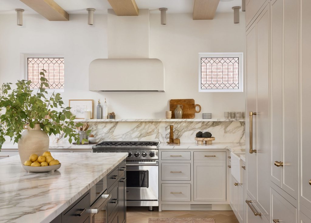
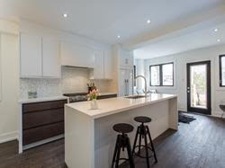
After: Kitchen
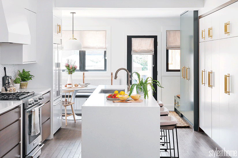
The actual kitchen didn’t need any major changes because it was brand new. But we knew we wanted to brighten it up and make it more inviting. We focused on making small changes that have a big impact – like adding potted plants and sleek brass cabinet handles. We also added more seating at the island – we wanted it to feel like an easy and comfy spot to have breakfast, do homework or chat.
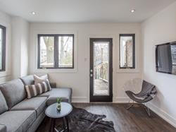
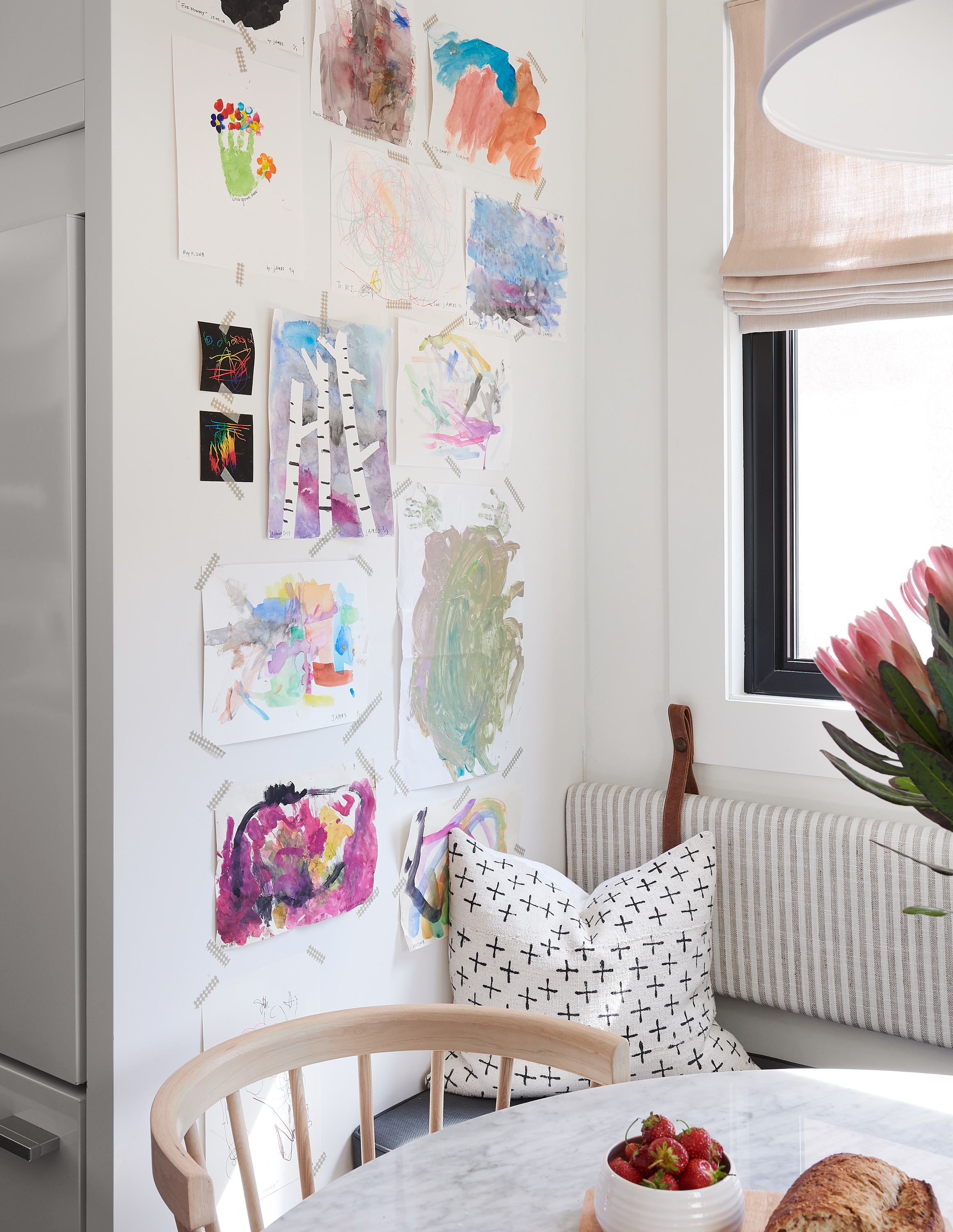
We decided to convert the family room into a multi-use space that serves as both a casual dining nook and a functional entryway. The dining nook feels so cozy and relaxed – the banquet seating saves space, provides extra storage, and makes it easier to fit more people around the table. Knowing that our clients have kids, we went with linen looking vinyl for the seating because it’s easy to clean but looks like the casual linens we used throughout the house. The leather straps are one of our favourite parts of this space – they add a masculine vibe and make the room look totally one of a kind. Displaying the kids’ artwork is such a personal touch and adds so much colour and warmth.
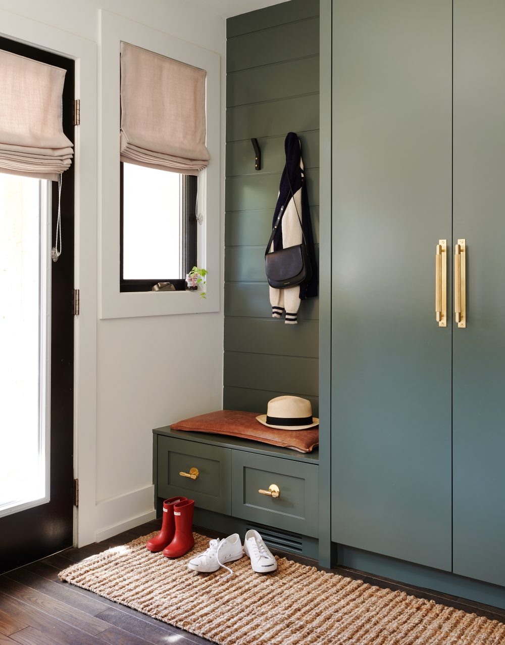
We think we might be saving the best for last with this one – we’re so obsessed with how this back entryway turned out! The safe option would have been to try hide this area by making it blend in with the rest of the room, but we are so thankful our clients trusted our gut feeling to do the exact opposite. We saw it as an opportunity to go bold and turn what could’ve been a boring space into something totally unique. The paint we used is Benjamin Moore’s chimichurri (read more about our love of green paints here!). Using a bold colour and adding a rug also helped make the area feel like a designated space (like at the front door) which helps encourage the family to use it as what it’s intended for. We added enough storage for a family of four and the bench is perfect for gearing up before heading outside (unfortunately necessary during Toronto winters).
We are so proud of how Project Helena turned out and we get so much joy knowing we’ve helped our clients create the perfect home for their family!
Thanks to Style at Home magazine for featuring this space and to Alex Lukey for the amazing photography!
Which project would you like to see featured as a Before + After next? Let us know in the comments!