


October 6, 2018
When we began planning for the Project Melrose kids bathroom, we were tied to the existing layout because of permanent elements like a plumbing stack, a diagonal wall and a fairly substantial window. Luckily, the layout was functional and with a few tweaks and some added details we knew it could be a great kids bathroom with tons of room for our client’s growing family.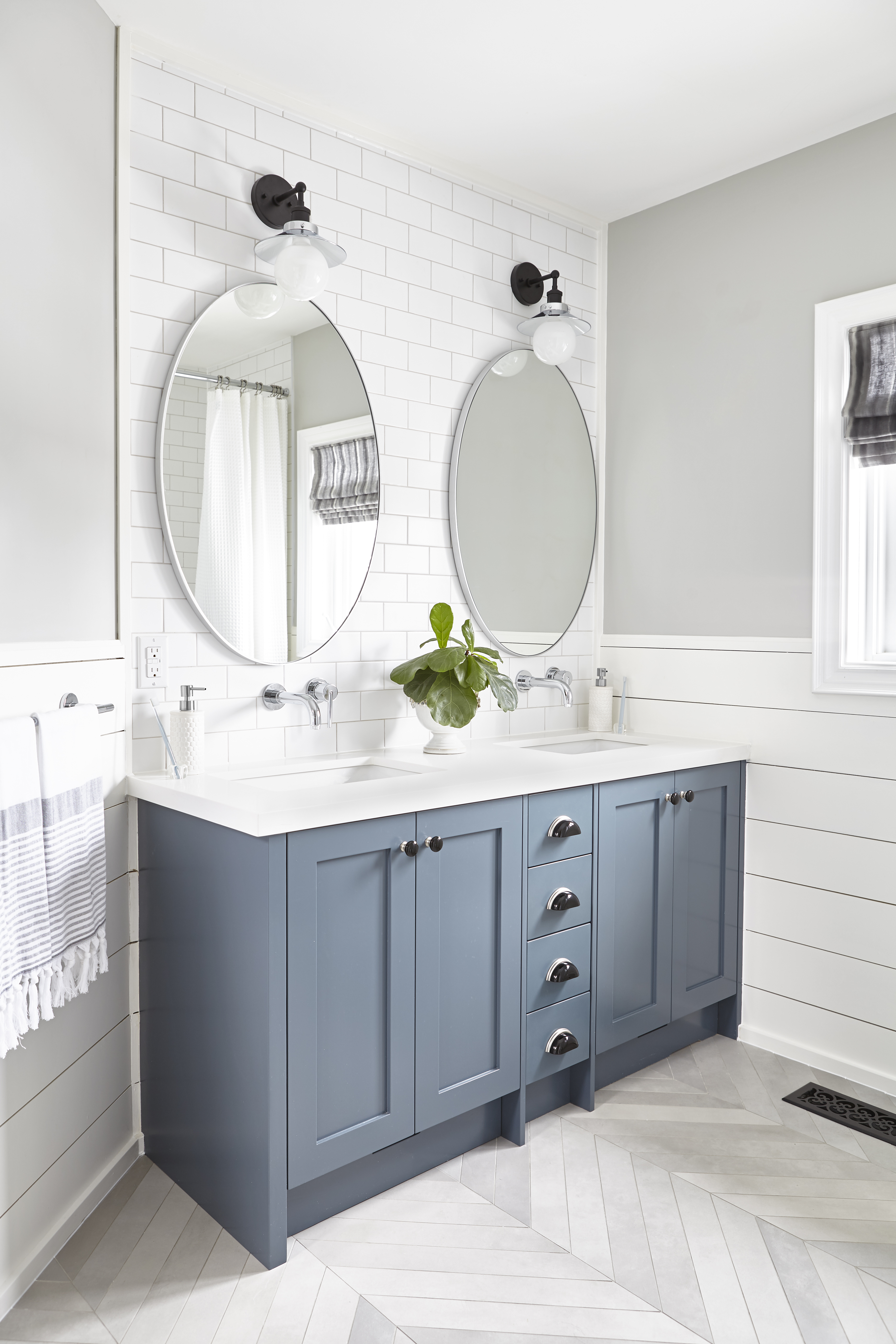 We chose to play off of the weird diagonal wall in the bathroom by choosing a tile that was laid chevron and followed the same direction. While it was intentionally laid straight from all major elements in the space (vanity, toilet and tub), you can see in the photo above that it runs at the same angle as the diagonal wall, making the otherwise dated architectural feature seem intentional.
We also chose to square off the vanity and change it from a single to a double sink. The wall mounted faucets reduce counter clutter and the small bank of drawers in the middle are perfect for kids toiletries.
Collective Tip: We mixed stainless steel, black and chrome finishes in this bathroom. As long as each finish doesn’t stand alone mixing metals is a great way to add detail and make a space feel less like a packaged deal.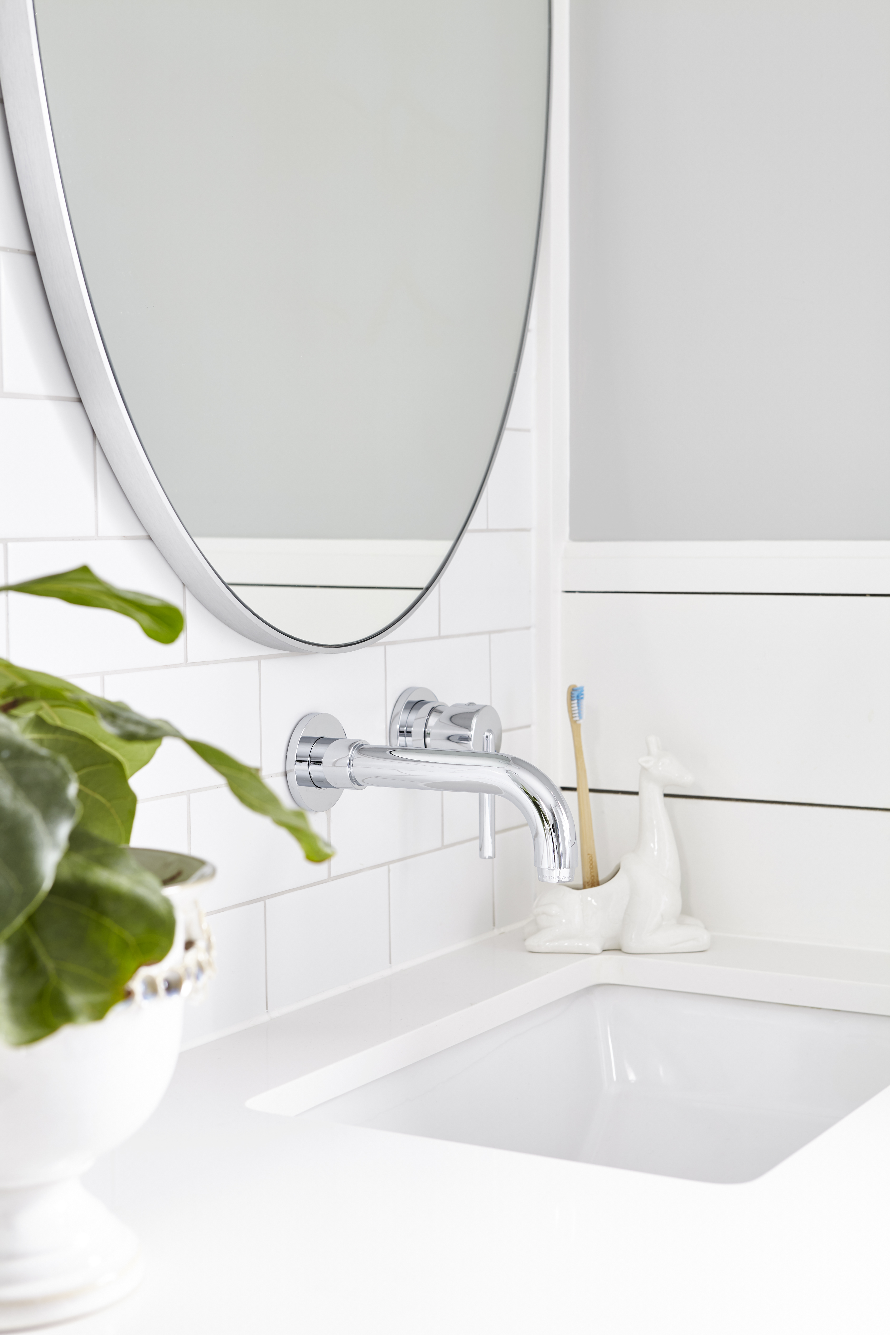 Under each sink we used the otherwise useless space in the kick to add a pull out stool so that our littlest client could reach the sink independently!
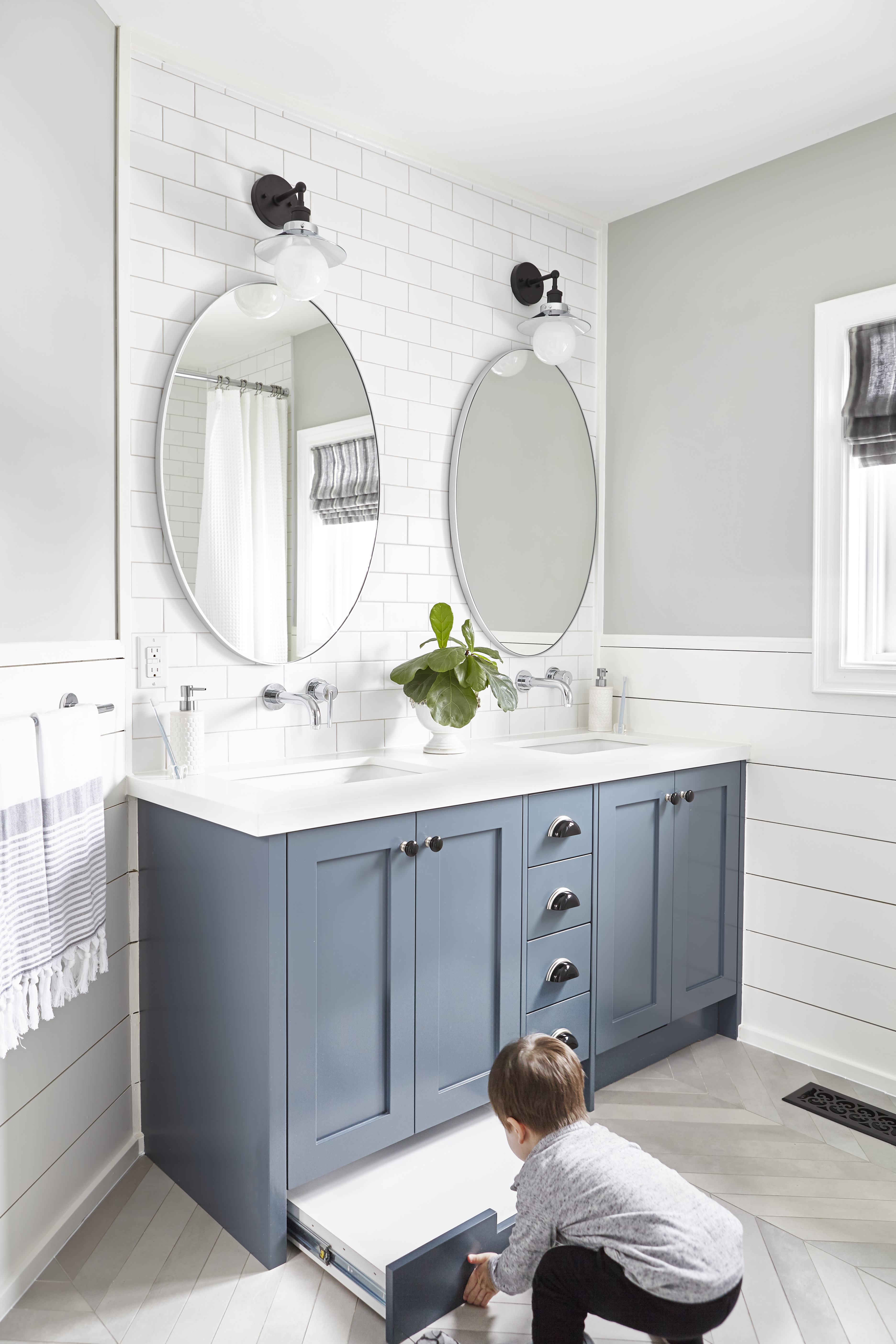
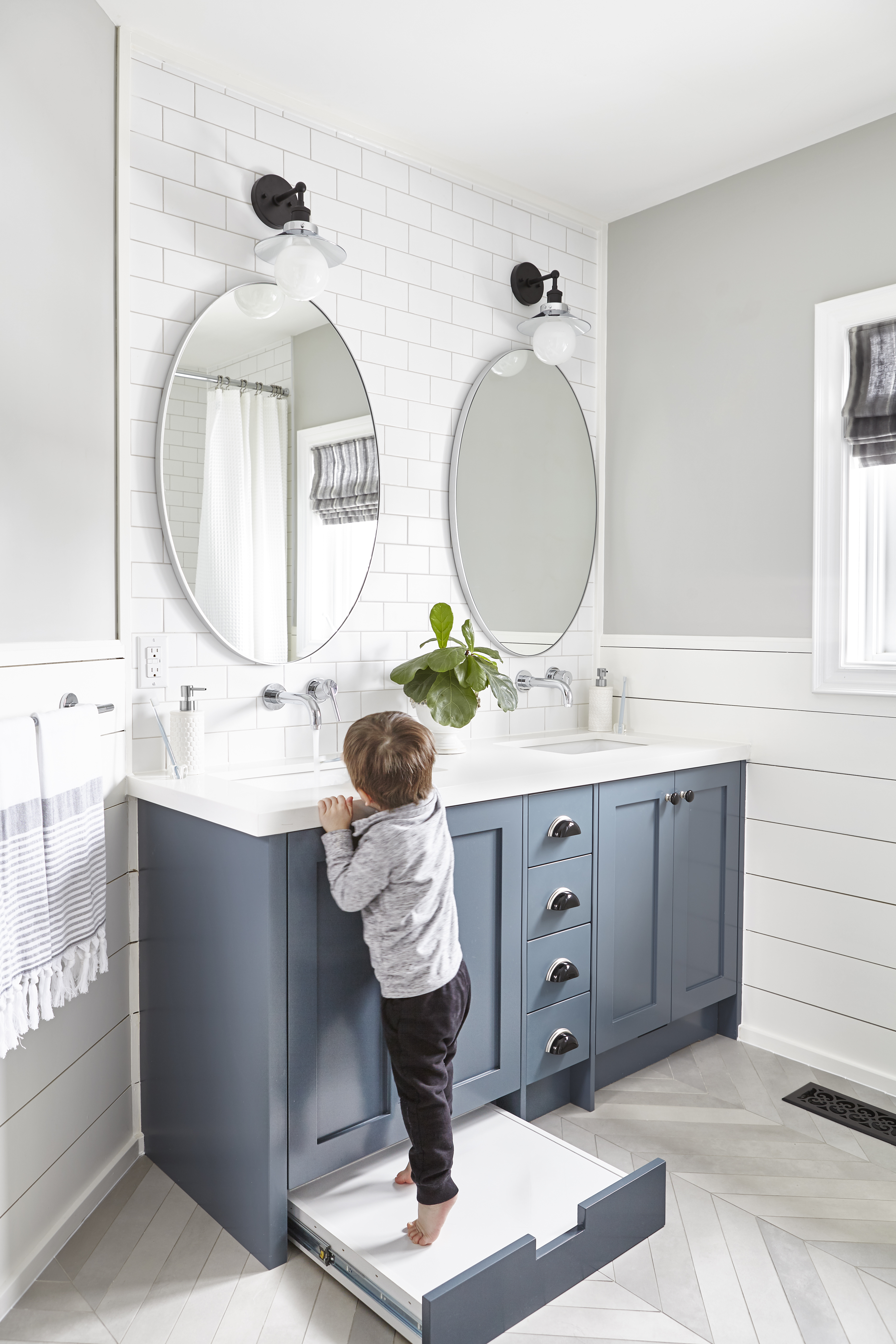 This is a great functional touch if you’re doing a custom vanity. The subway tile backsplash and shiplap wainscotting are an inexpensive way to add tons of detail and durability in the kids bath.
BEFORE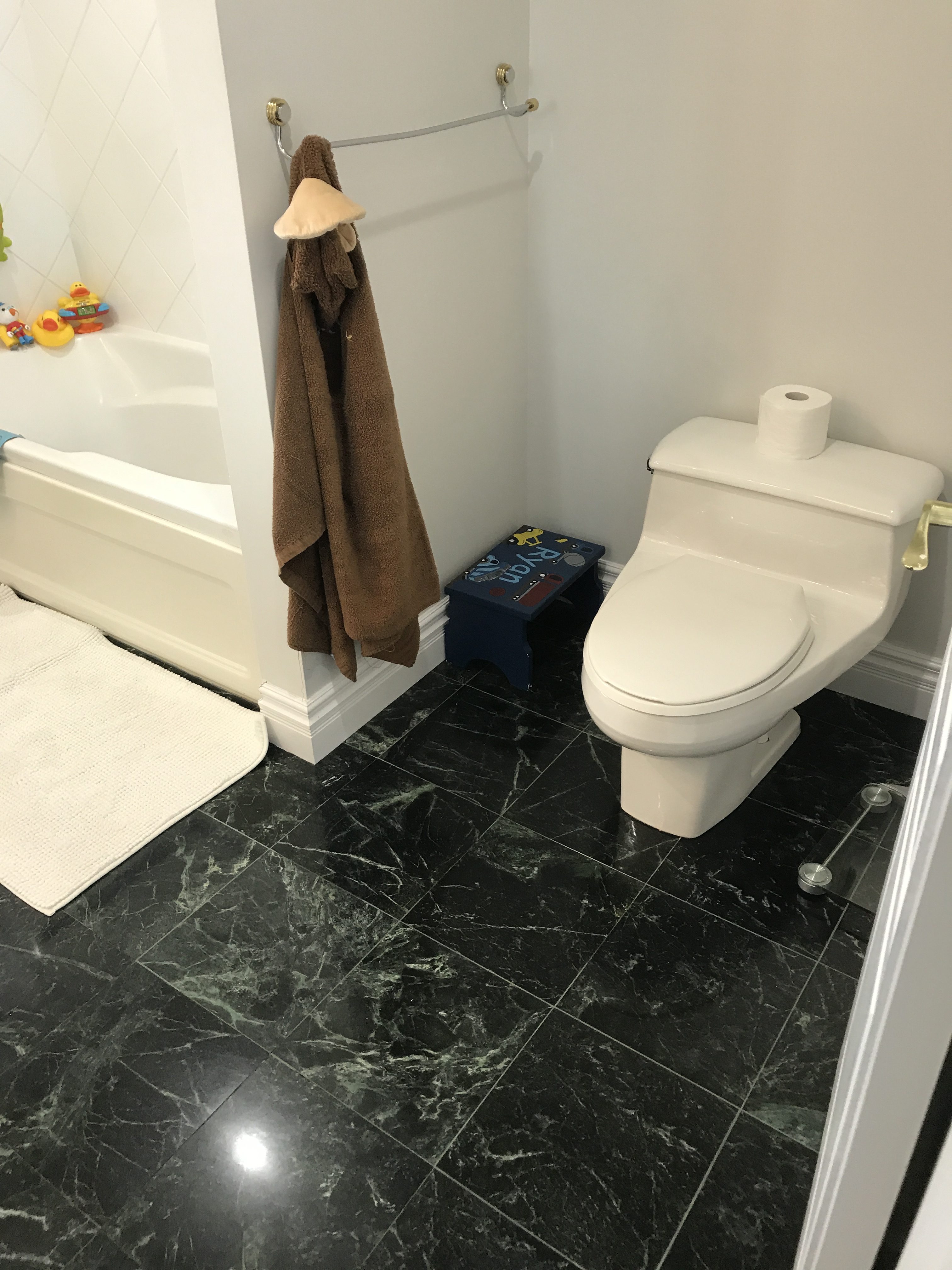 AFTER
AFTER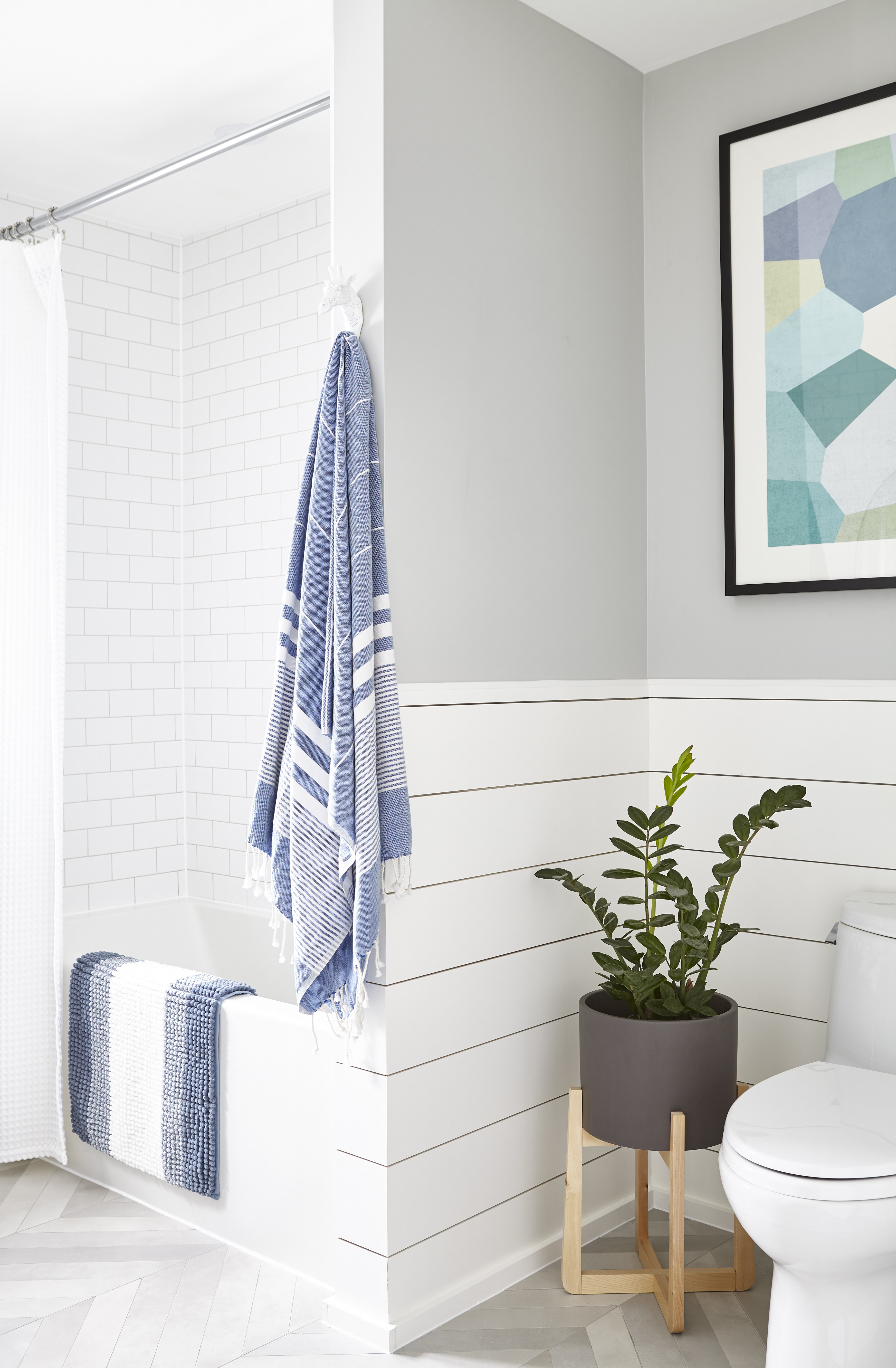 BEFORE
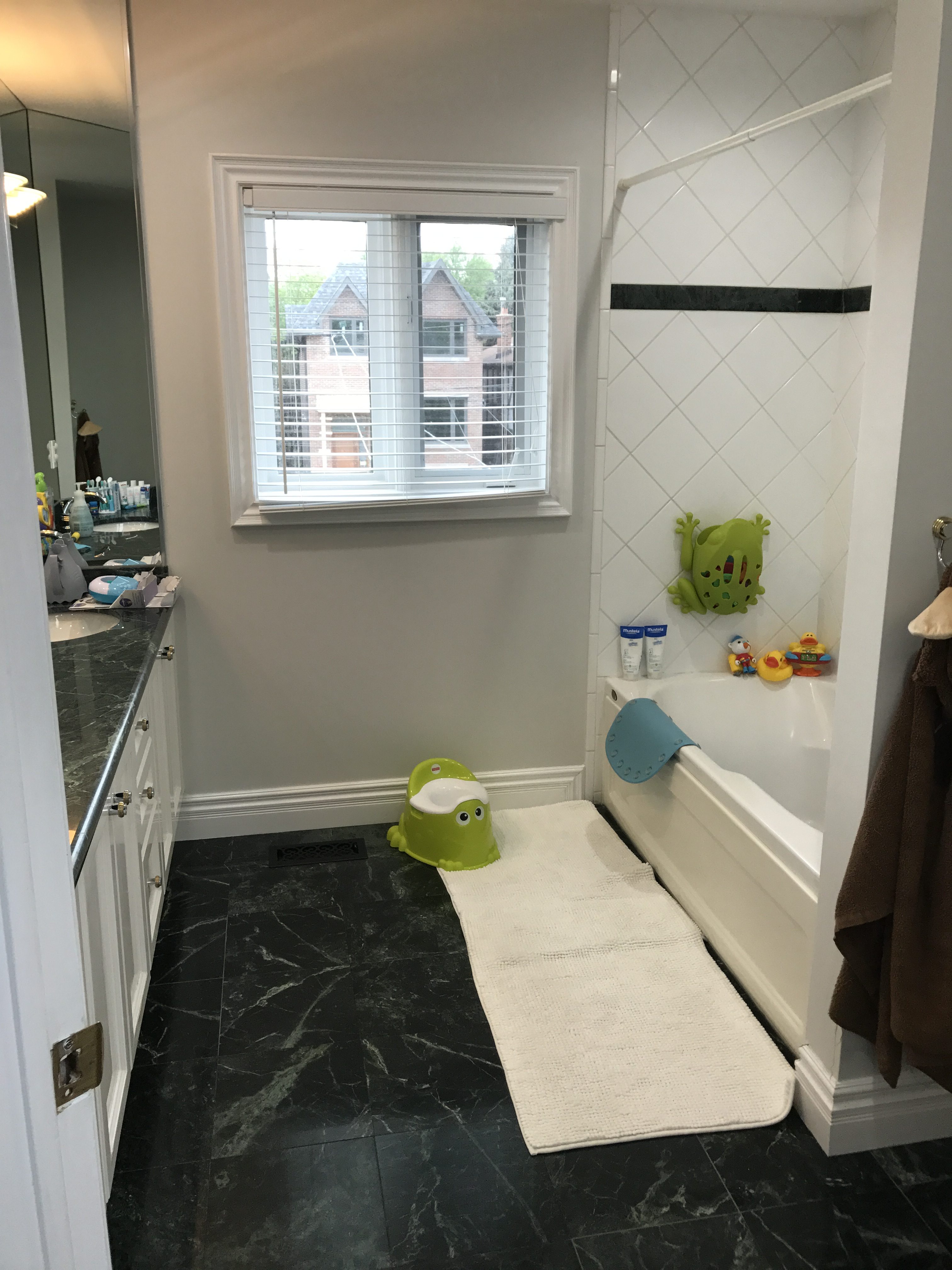 AFTERWould you be happy bathing your kids in a bathroom like this!? Let us know in the comments below!