


April 24, 2019
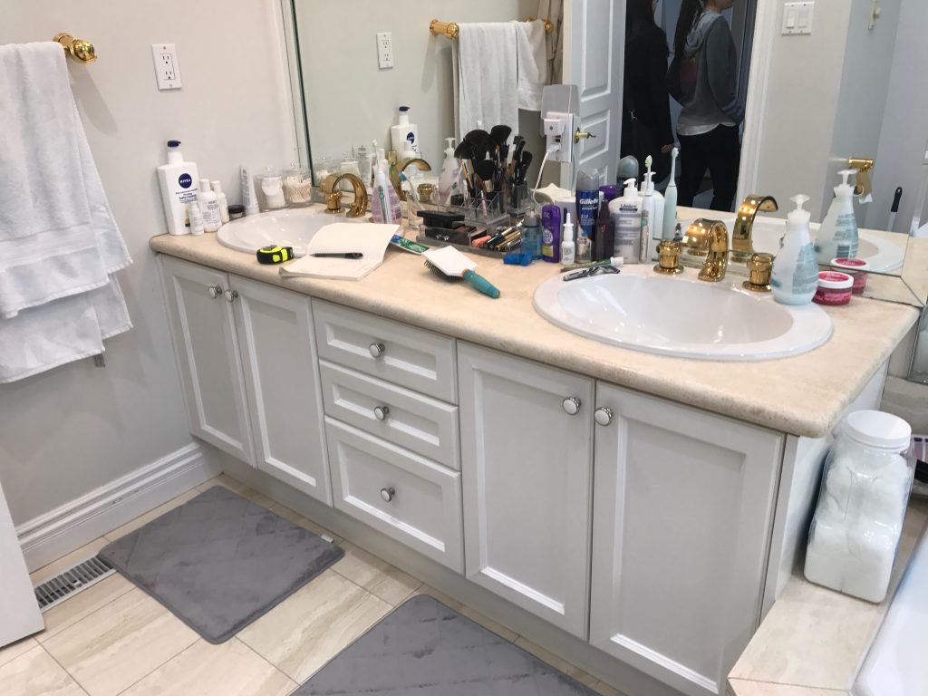
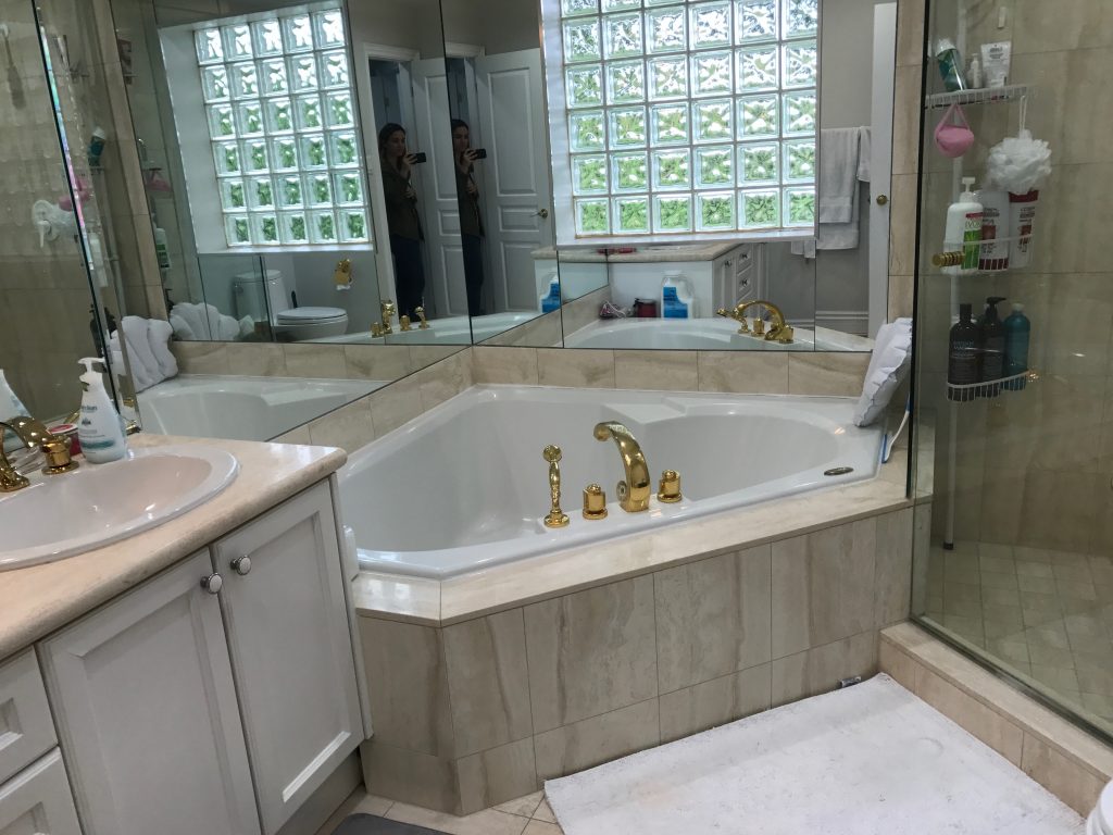
When we shared before and after photos of the Project Melrose Master Bath on Instagram, we got more than a few comments from followers who couldn’t believe that it was the same room in both shots. We take that as the ultimate compliment, since the “before” master bath looked and felt outdated and disorganized. It screamed 1990’s – complete with a corner tub, block glass windows, and shiny gold hardware.
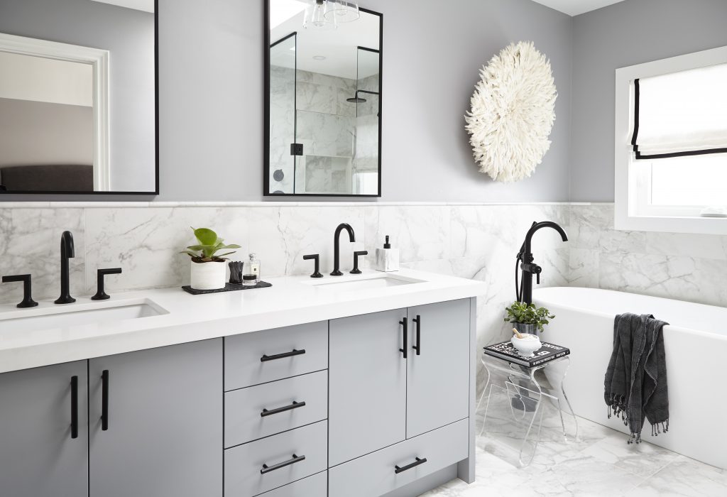
The “after” we created feels current and showcases some of our favourite master bath design elements – from the spacious vanity, to the sleek finishes, to the seriously enviable soaker tub (and don’t even get us started on that transition free shower!). We promised that we’d share a more in-depth look at this amazing transformation, so here it is! Keep reading to see what went into designing the Project Melrose Master Bath.
Our main goal for this project was to design a beautiful and organized space that our clients could enjoy every day. We like to think of a master bath as a luxurious, relaxing oasis in a home, and that’s exactly what we wanted to create for our clients.
Before
After
It goes without saying that the room was far from oasis-like to start. The white and beige vanity complete with a Formica counter-top was particularly reminiscent of decades-past and was brimming with products. Because the vanity was already the biggest it could be, we knew our design would have to incorporate better storage solutions in order to boost organization.
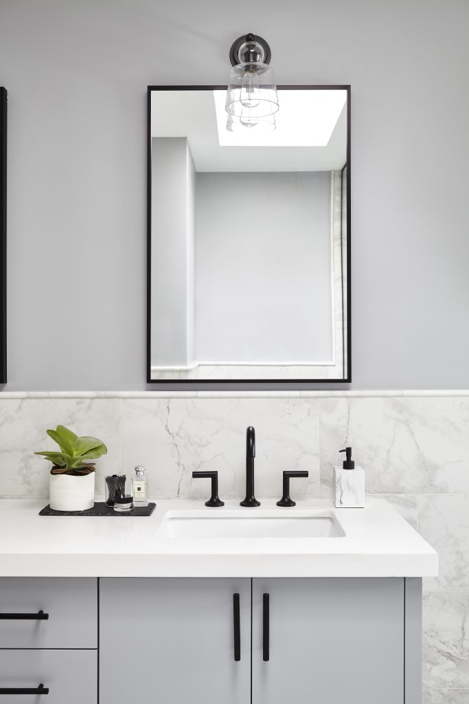
We designed a custom vanity topped with a crisp white Caesarstone counter that is much more durable and easier to clean. We managed to add in some much needed storage by sneaking in three new drawers – we turned the deep bottom drawer into two shallower ones and added an extra one under each cabinet to give the couple dedicated “his” and “her” storage. While it might seem counterintuitive, shallow drawers are actually more space efficient and easier to keep organized.
We painted the vanity Stormy Monday by Benjamin Moore, which is the same gorgeous grey colour as the walls. We opted for modern black faucets and plumbing (all from Brizo / Delta) and hardware that create a cool contrast against the classic white and grey colour palette. Next, we removed the mirror that wrapped around the entire room and added two smaller, framed mirrors topped with simple sconces. This creates the illusion of more space and prevents the mirrors from constantly being splashed by water from the sinks. The backsplash is actually the same tile we used on the floor and halfway up the walls throughout the room, which gives it a seamless look and is more budget friendly than using a slab.
Before
After
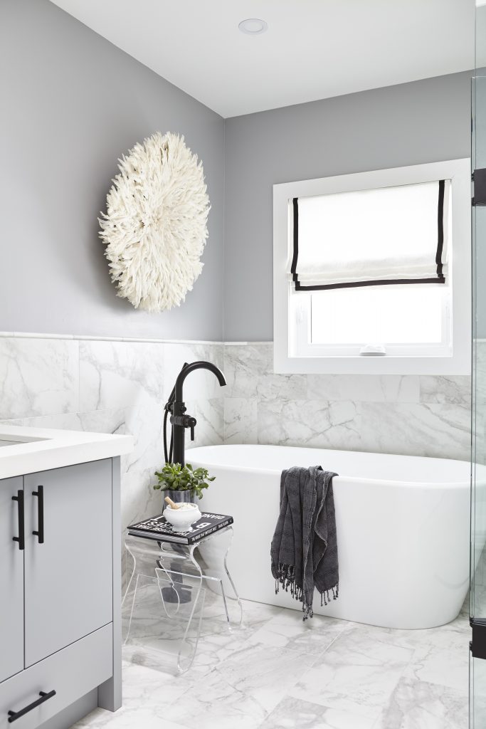
Safe to say we were beyond excited to get our hands on this little corner of the room and see it finished without the block window, mirror, and corner tub. We chose a freestanding soaker tub and matte black tub filler that look infinitely more luxurious than the previous bathtub. We added in a clear accent table that is perfect for storing basic bath necessities (or a laptop for binging Netflix in the bath – level 10 relaxation), but still looks streamlined.
We love the feathered Juju piece (similar available here) – it’s a great alternative to an art print and it adds the perfect touch of texture and glamour. Finally, we added a custom roman shade to the window, which allows for more privacy and still lets in natural light.
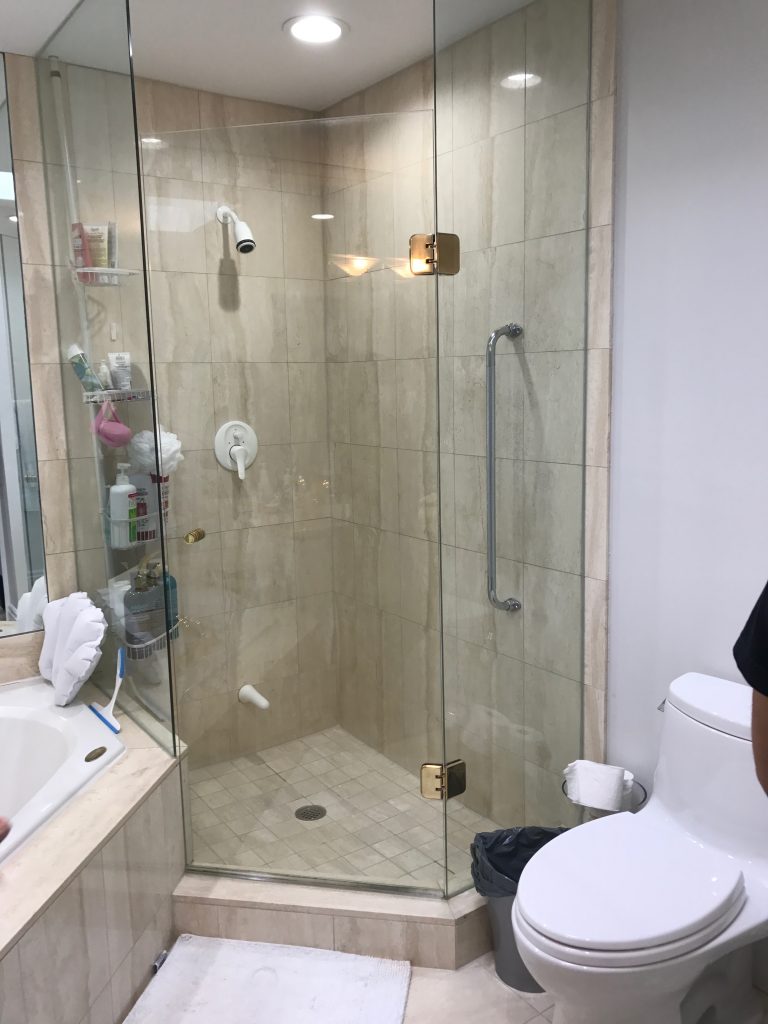
Before
After
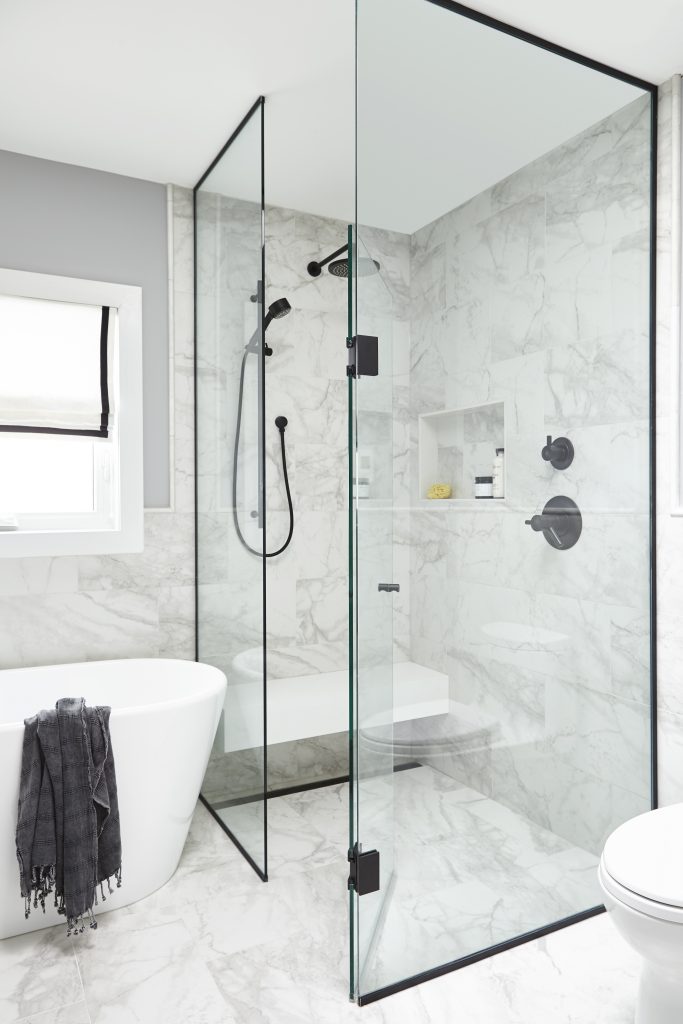
We definitely wouldn’t mind starting our day in this beautiful shower! Funny enough, this is the part of the room that we’ve gotten the most questions about. We like to think that it’s because of all the special details here – from the black framed glass to the integrated drain (it’s under the bench!).
The original shower in this master bath was simply not working for our clients – it added a lot of bulk to the room and had features they didn’t need, like a large safety bar and second faucet. We wanted the shower we designed to feel spacious, sleek, and like a natural extension of the rest of the room (rather than seeming like it was crammed into the corner, as the original one did).
We achieved this by choosing a matte black shower system, tiling it with the same marble we used throughout the space, and keeping the shower flush with the floor (that elongated hidden drain is key to making this work!). The matte black shower system is from Brizo and we love how it looks. We also updated the shower’s shape to feel more modern and added a storage nook to provide a designated spot for products. The built-in bench is the perfect finishing touch – it adds an element of spa-like luxury that really sets the tone for this space!
What’s your favourite part of this transformation and which project would you like to see a Before + After on next? Let us know in the comments!