


October 6, 2018
When we started pulling together our Briar Hill client’s kitchen inspiration photos and notes, there was one common theme: blue and white cabinetry with brass hardware. Our immediate feedback was “This is great, we’re so happy you don’t want an all white kitchen…” followed by, “Now we just need to convince you that you don’t want a royal blue, nautical feeling kitchen either!” Here’s where we ended up!
We began working on new floor plans and kitchen elevations and pulling colour samples of subdued moody grey-blues. We narrowed it down to four Benjamin Moore colours and made sure to test all of them in the kitchen, once the floors were completed, for our client to approve. This is very important when picking paint colours because floors and lighting play such a huge part in how colour is perceived. In the end we are so happy our client’s trusted our vision and let us take their dated yellow kitchen and turn it into a classic blue and white transitional space.
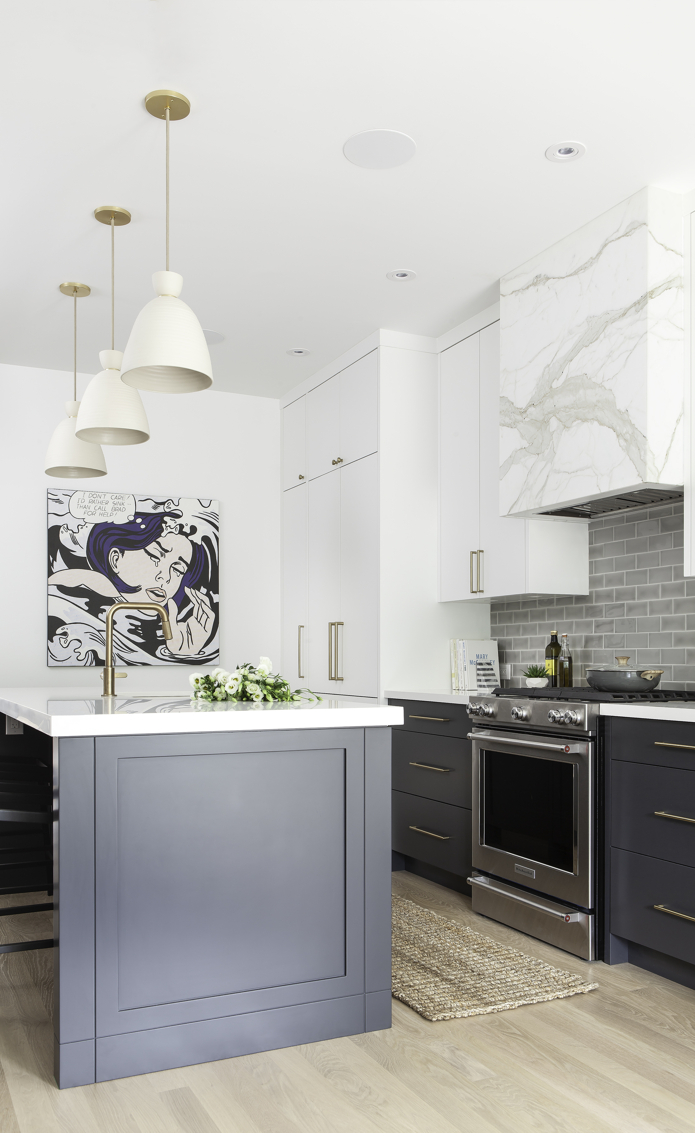
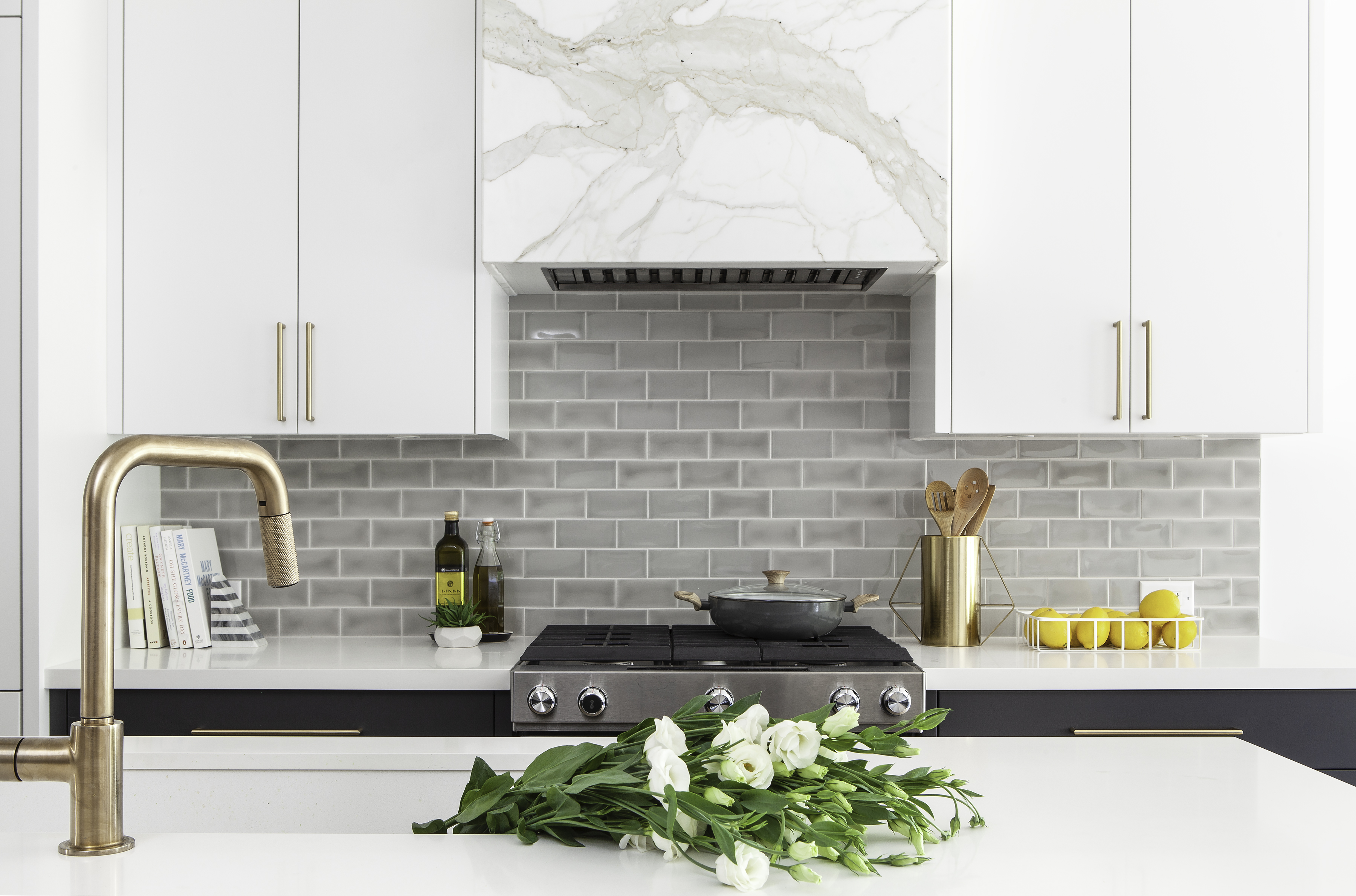
By combining shaker and flat cabinet profiles, mixing blue and white, and knobs and pulls, we were able to define different zones throughout the kitchen and add a lot of dimension to the space. The grey/blue subway tile backsplash added some much needed texture and depth and going with a classic brick lay, over stacked, gave the streamlined and modern white cabinets and countertop a more classic, homey feel.
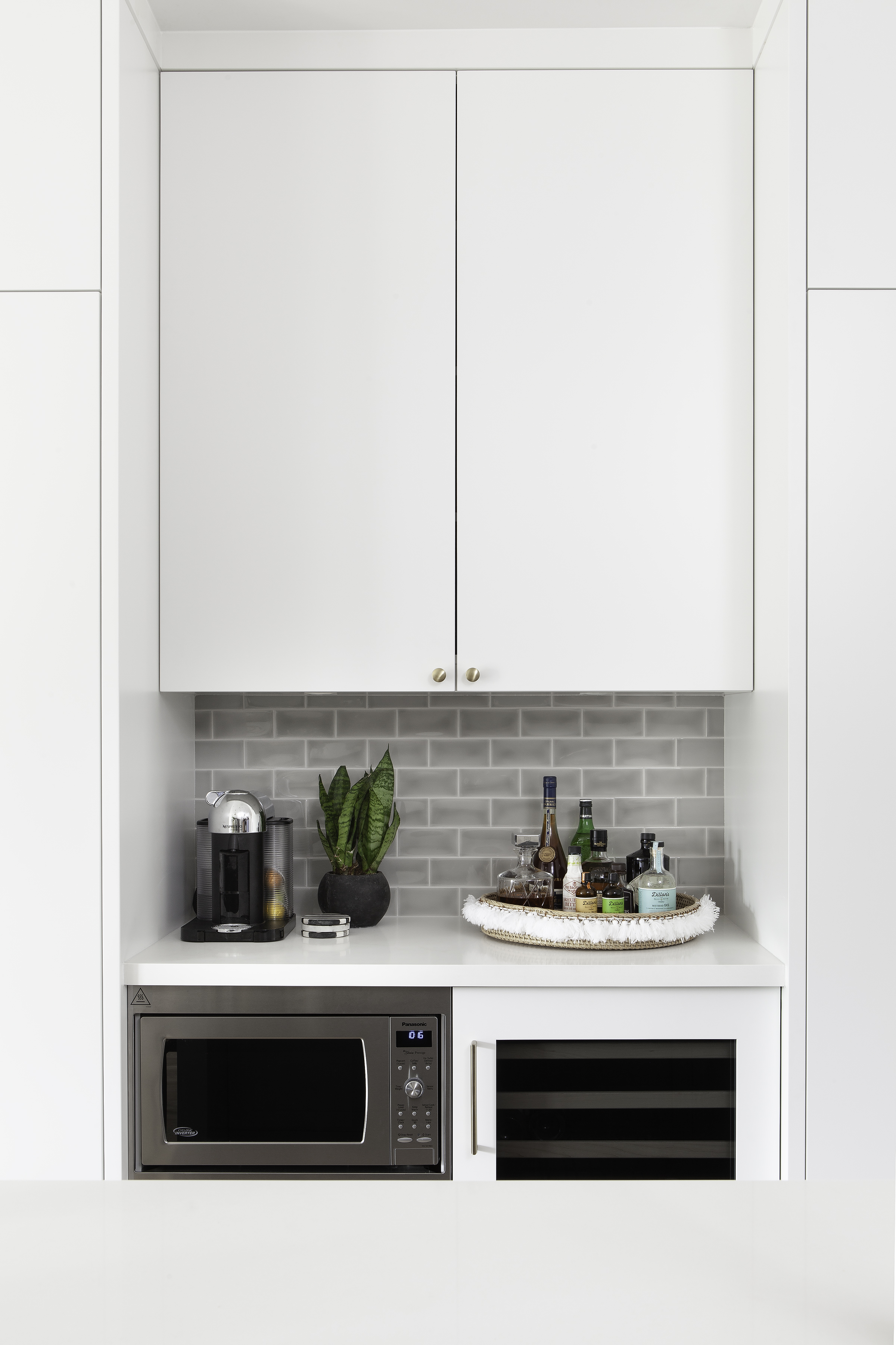
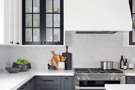
The Instagram fan favourite from this kitchen was without a doubt the Calacatta Gold range hood… and for good reason! It’s even more beautiful in person. We did everything we possibly could to make this statement hood work with our client’s budget and when we finally found this remnant slab, after weeks and weeks of hunting, we were pinching ourselves. Our fabricator did such an amazing job book matching the mitred edges, and no matter which angle you’re seeing it from it looks like a seamless masterpiece. The caramel and grey tones pull in the brass hardware and faucet and the backsplash beautifully, while the warm white background of the slab plays off of the natural ceramic pendants, giving the kitchen a more lived in feel. Can we also pay close attention to the knurled detail on the Brizo faucet pull down (the handle is also knurled but it’s cut off in the photo below). So good and so functional!
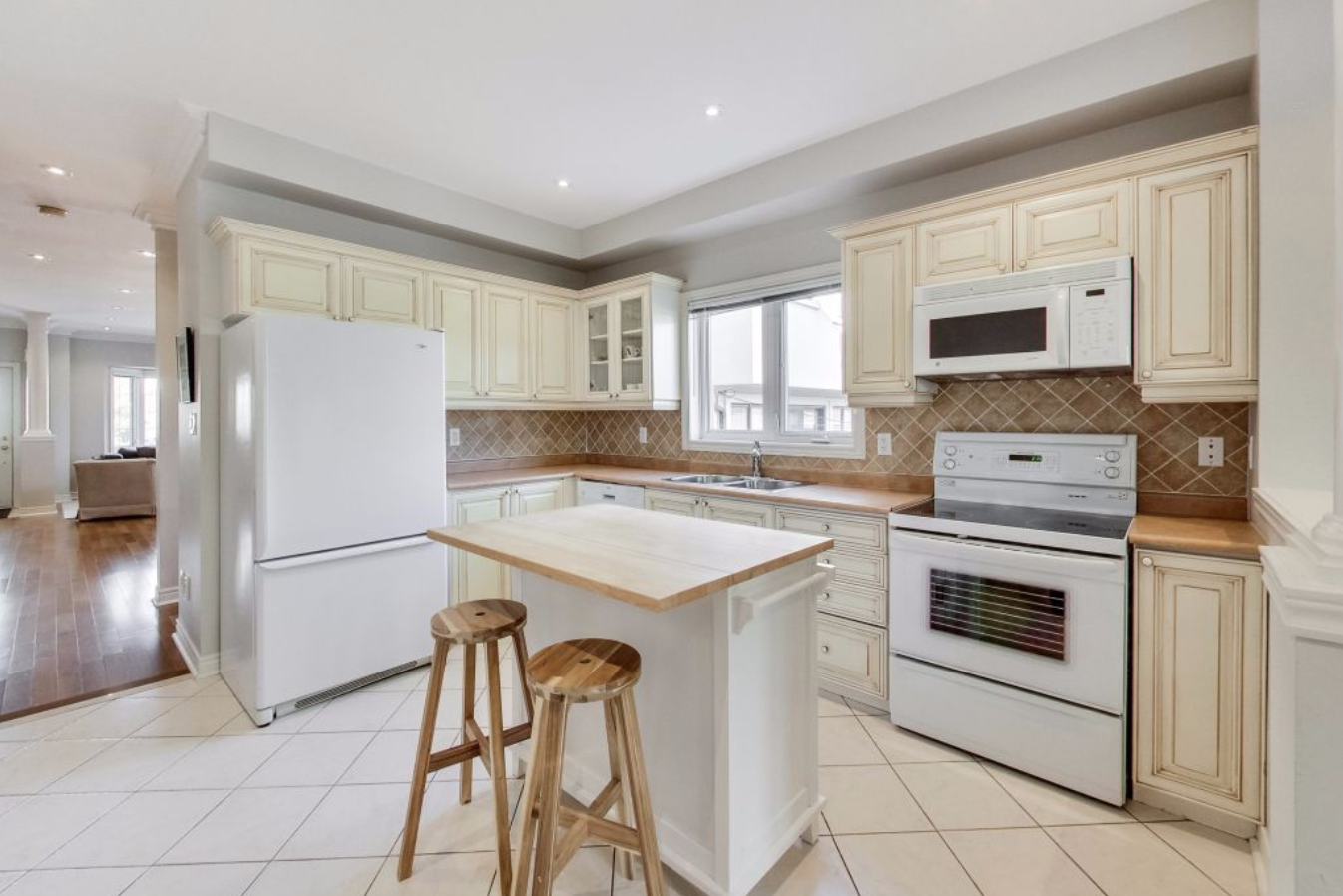
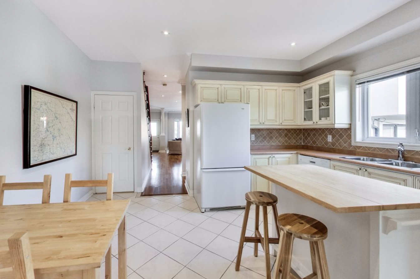
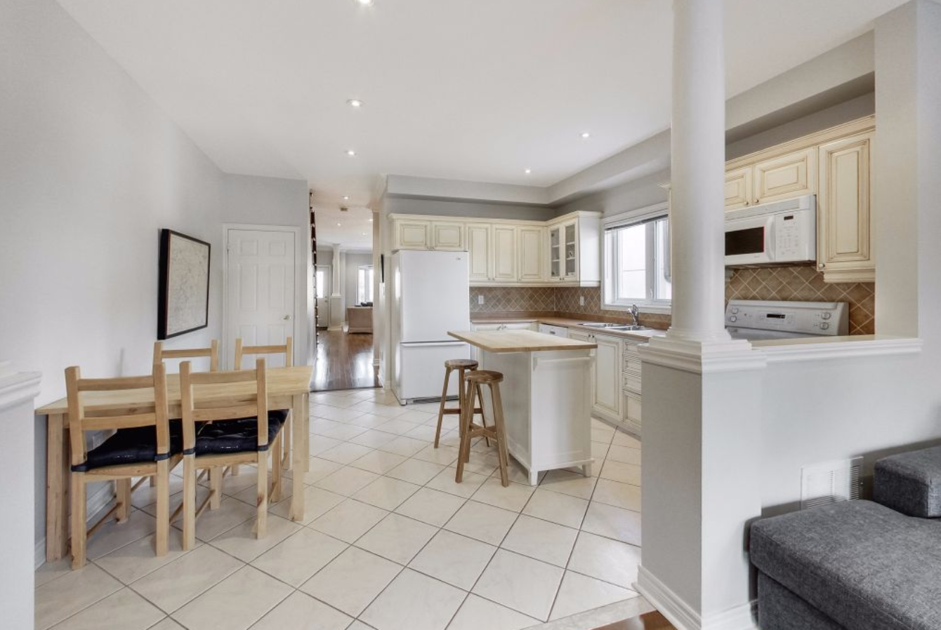
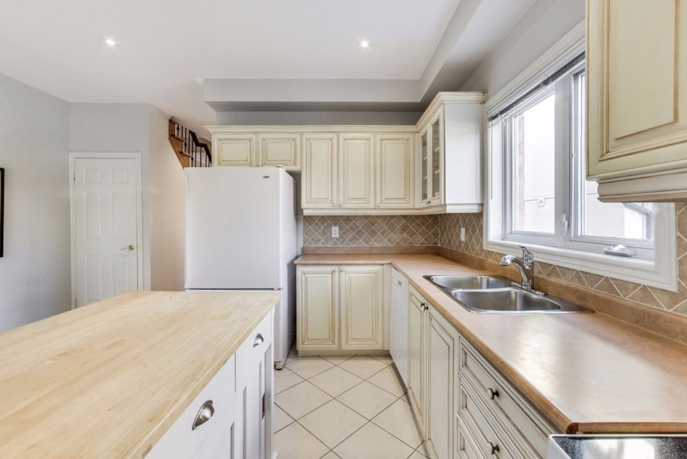
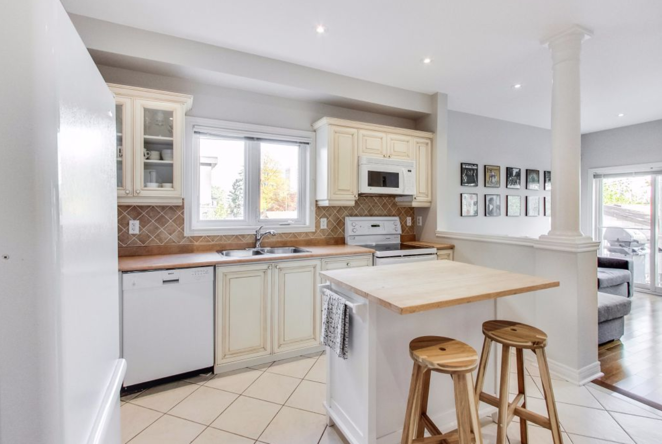
This wouldn’t be a Collective Studio Before and After post without a trip down memory lane… while the kitchen was functional and in great shape it was suffering from all the classic “90s builder grade” issues. Let’s take quick trip back to where we started, shall we?
BEFORE
AFTER
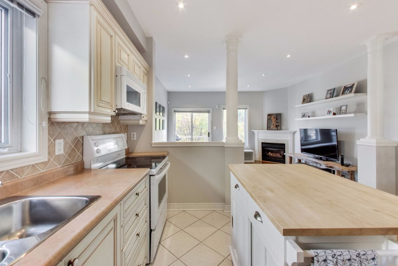
The two photos above are taken from the same angle. By removing the window and hiding / relocating some of the ducting we were able to create a much more usable floor plan with tons of storage. Removing a window always takes a ton of convincing, but if you’re ever faced with the same dilemma try and consider which direction the window is facing and what your view is as your first voice of reason — in this case it was an east facing window (meaning it would only get direct sunlight early in the morning often before anyone was awake and in the kitchen) that looked onto the neighbours back deck. It was a no brainer. We also removed the knee walls and decorative columns allowing us to gain an additional foot of kitchen without sacrificing any space in the adjacent family room.
BEFORE
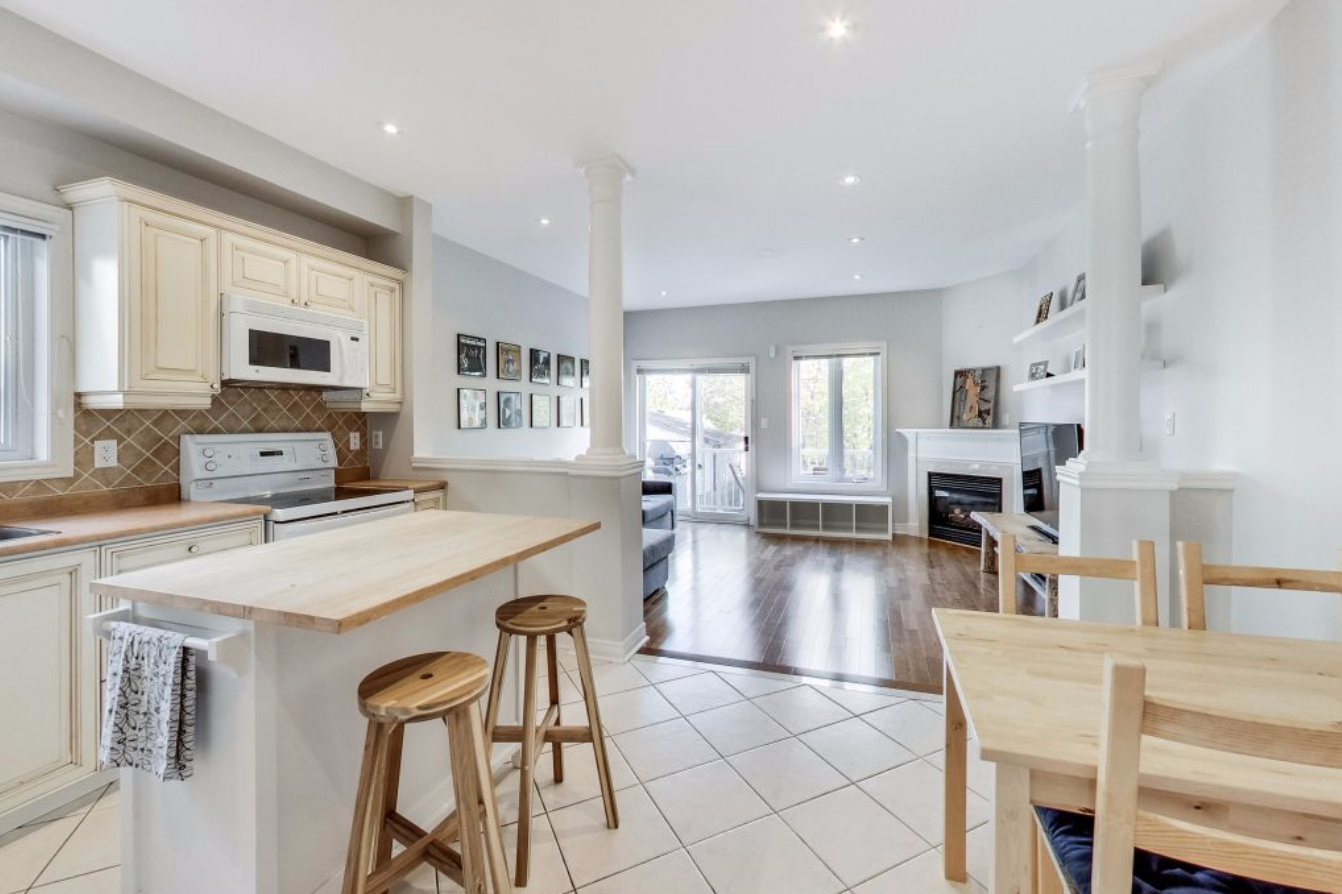
The new layout is definitely much more practical for our client’s growing family and of course more their style! We hope they will enjoy it for years to come! What’s your favourite part of the Project Briar Hill Kitchen? Let us know in the comments below!
Your website is so professional with so much to explore. The transformation with the Briar Hill kitchen was remarkable. It was nice to see the explanation about it in the blog. The before and after photos are great. Making the space more effective without the window was very innovative. All your projects show so much unique creativity. Looking forward to seeing more completed in your stunning portfolio.