


March 8, 2019
Earlier this week we hosted another Q&A on our Instagram stories. We love hearing from you – it gives us a chance to look back on our projects and tune in to what details made an impact. We’re all about sharing design advice, so keep reading to see some of the questions and find out our answers!
1. What are your favourite lighting stores?
We always find great options at Rejuvenation, CB2, Mitzi, Crate and Barrel, Schoolhouse, Restoration Hardware, and Wayfair.
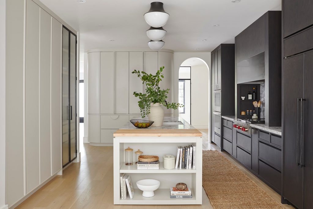
2. What are some lighting trends for 2019?
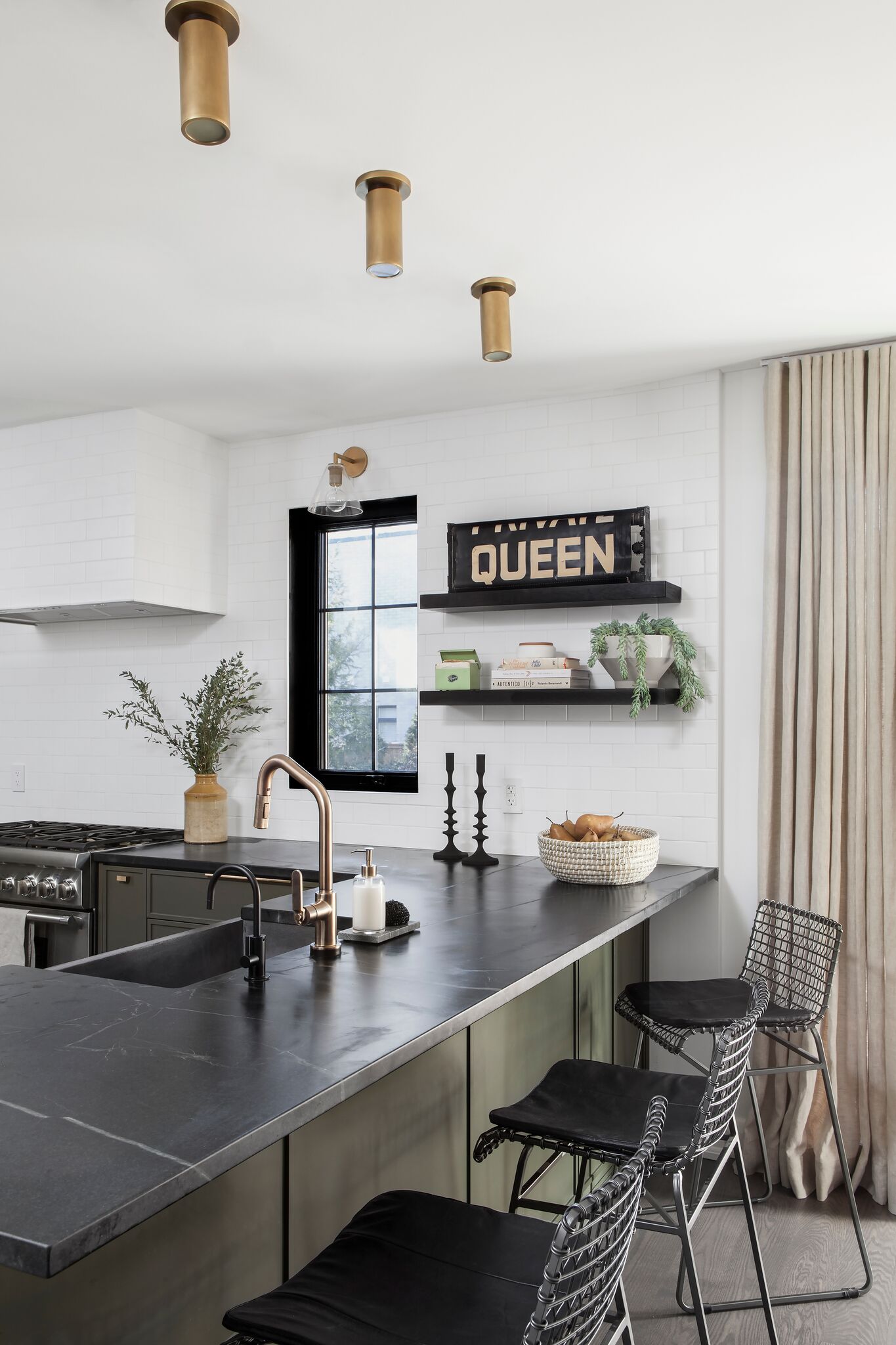
Flush-mount lighting – we keep seeing it in unexpected places, like over kitchen islands (where you would typically see pendants) and in hallways and common spaces (where you would typically see pot lights). We did this in our Project Westgrove kitchen (below) and at Project Rushton.
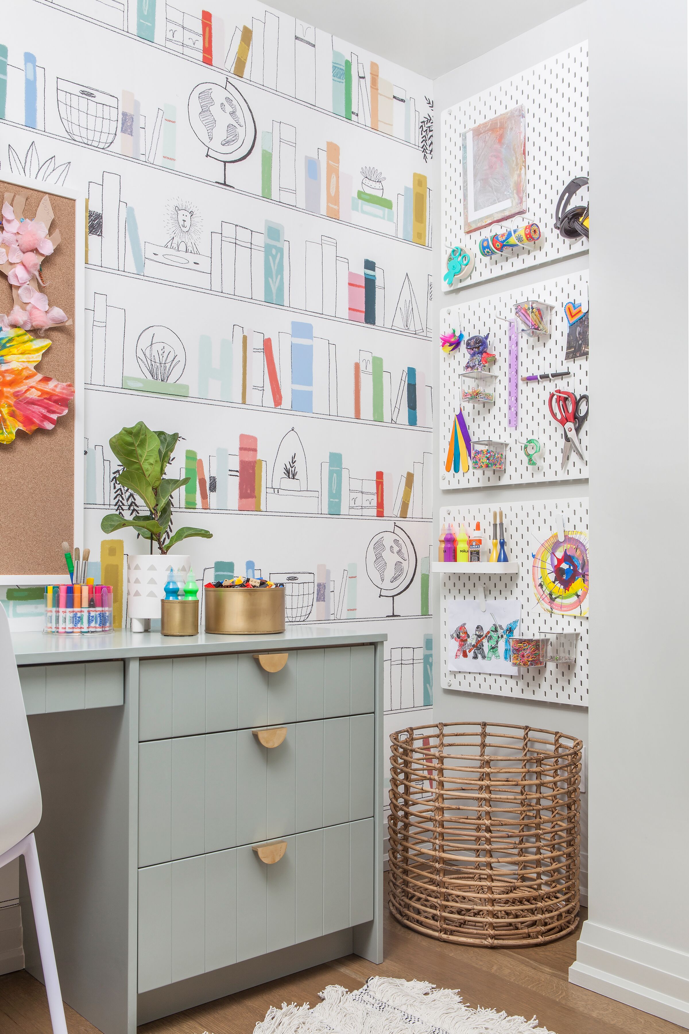
3. Where did you get the wallpaper you used for the Project Lytton crafts/homework room?
We’ve gotten so many comments about this wallpaper! It’s from Anewall – it really pulled the whole space together and made it so unique.
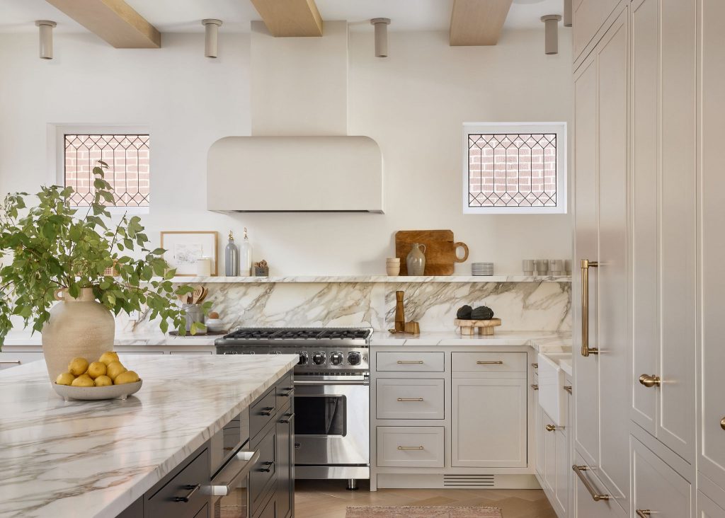
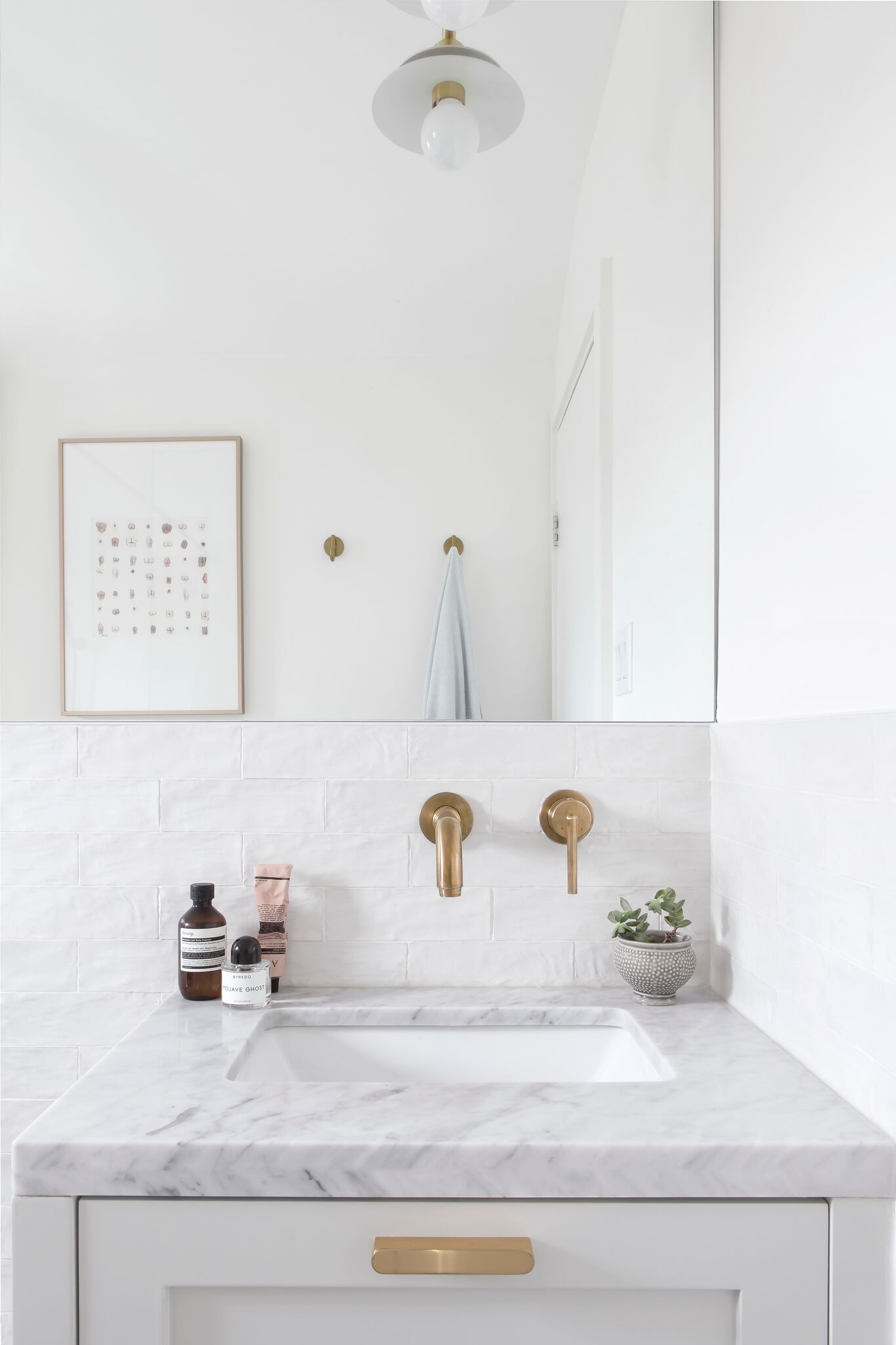
4. Do you have any tips for making a space seem bigger?
Scale is so important when purchasing furniture, as a room can appear much smaller if the furniture is off scale. Paint colours also play a large role in creating the illusion of a larger room. Sticking to lighter colours make the room feel larger, bright, and airy (as long as they get enough natural light), while darker colours tend to make rooms feel smaller and cozier. One quick fix is to add in a mirror – the reflections make the room appear larger. The large mirror we used in Project Glenora (below) helped the bathroom feel so much roomier!
5. What are your favourite hardware trends for 2019?
We’re into integrated hardware at the moment – stay tuned for pictures in our recent projects!
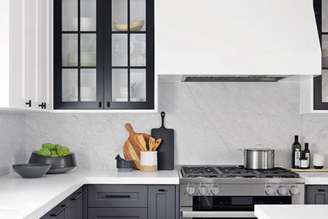
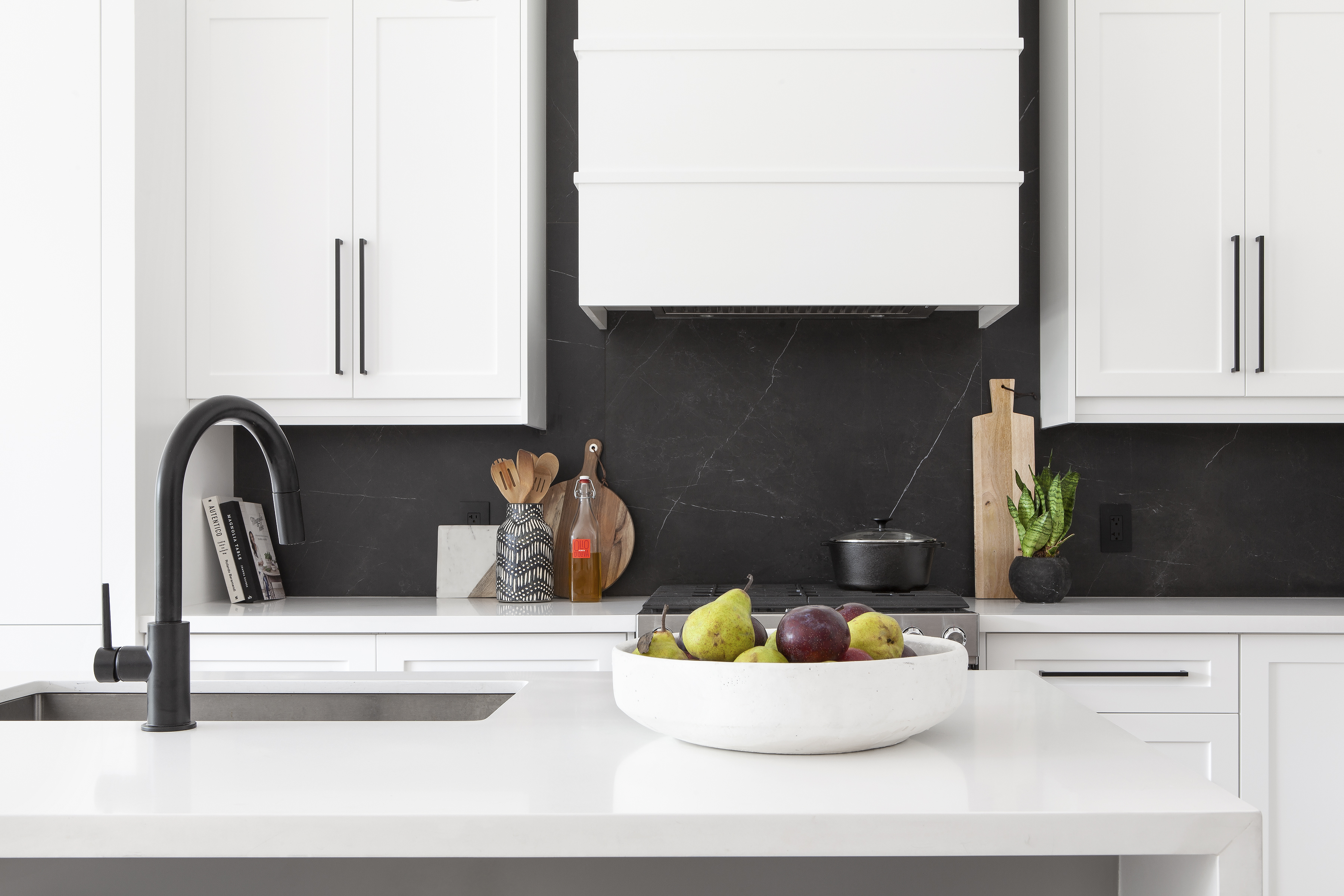
6. Any tips for picking a countertop that’s durable but still pretty/not too trendy?
There are tons of options these days – we have come a long way (thankfully). We use a lot of Caeserstone (below) and other brands of quartz countertops in our projects. We love Super White granite and soapstone too – they are both extremely durable natural stones! We also have a love affair with marble, but we understand it can be intimidating with the matinance and overall use. When clients are scared to use it on their counters, we often push for a slab backsplash to achieve the overall look. The below backsplash is actually a large scale porcelain tile!
7. What are your favourite grey paint colours?
Our favourite light greys are Stonington Grey and Collingwood and our favourite deep greys are Wrought Iron and Kendall Charcoal – all from Benjamin Moore. Always remember to test colours before committing as all paint have undertones and the sun/light can truly effect the end result.
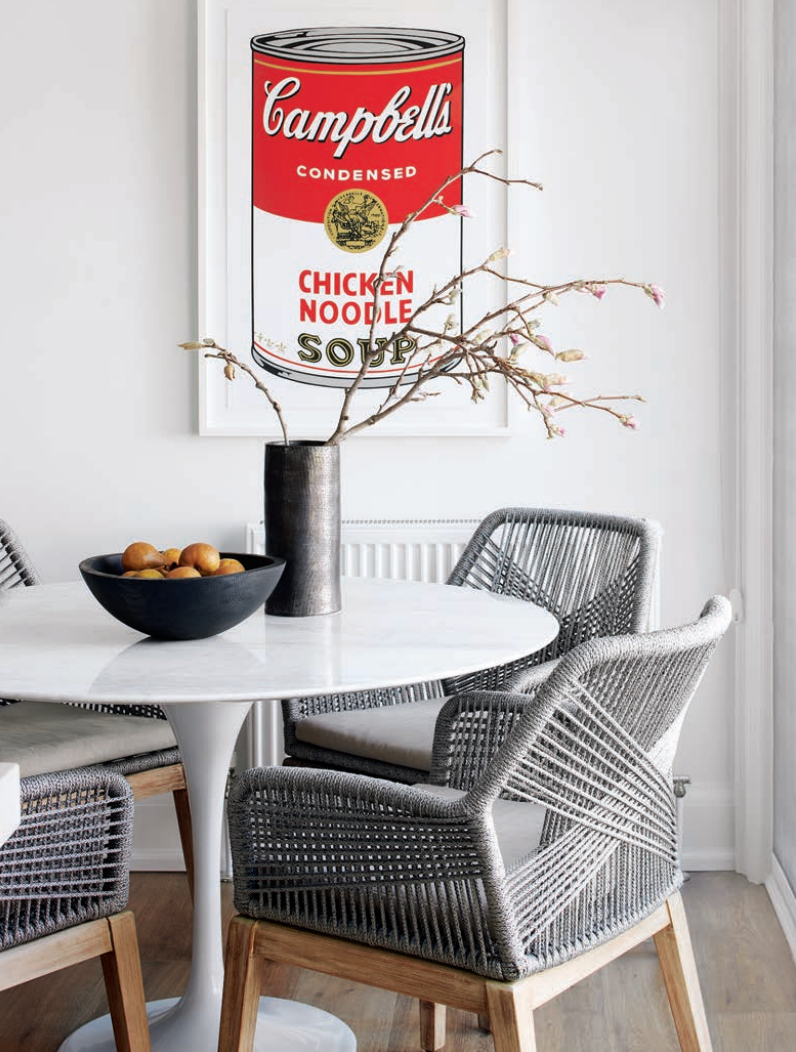
8. Favourite sources for dining/kitchen chairs?
We love DWR, LD Shoppe, Elte Mkt, Article, and Wayfair (which is where we found the amazing chairs for Project Ridelle, below!).
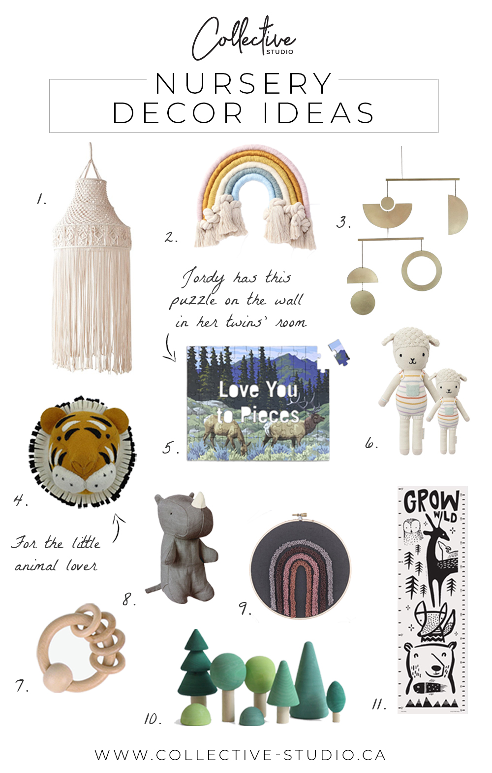
9. Where did you get the animal prints for the Project Bathurst nursery?
We found them on Etsy – they were a printable file that we had blown up and printed on art paper. If you’re looking for more nursery decor ideas, check out this blog post!
10. How do your fees work for full service design/custom homes? Do you charge by the hour or is it a flat rate?
Thanks for your interest, please reach out to us at Hello@Collective-Studio.ca for more details about our process!
Check out last month’s Q&A here for more design advice. Don’t be shy – slide into our DM’s or comment on any of our Insta’s to have your question answered in next month’s Q&A post!