


March 13, 2019
Project Ridelle was such a fun one for us because we had the chance to truly transform this space – you’ll barely be able to tell that it’s the same room in the before and after photos!
When our clients purchased this house, it had a lot of factors working in its favour: tons of space, a large backyard, and an amazing neighbourhood. While the house had “good bones,” our clients recognized that the interior would need pretty significant updates. That’s where we came in!
Kitchens tend to be one of the most-used rooms in a home and often serve as a hub for the family to spend time with each other. In terms of design, kitchens can “age” a house more than other rooms, since kitchen trends tend to become so widely popular and end up being associated with certain time periods (this particular kitchen was definitely reminiscent of past decades). For both reasons, people often prioritize renovating or re-designing their kitchen, as was the case with our clients.
Before
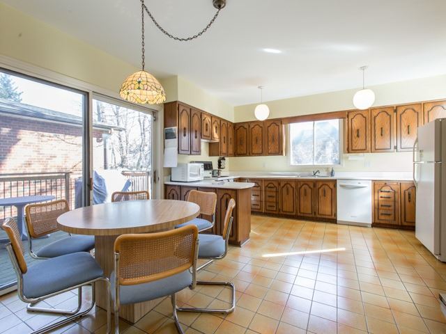
Aesthetically, the room looked outdated and the design elements were far from cohesive. We wanted to pare everything down and create a space that felt modern and sleek, but still timeless (unlike the previous design). More than anything, we wanted to transform the kitchen into a room that our clients loved to spend time in.
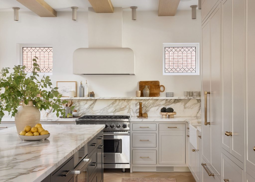
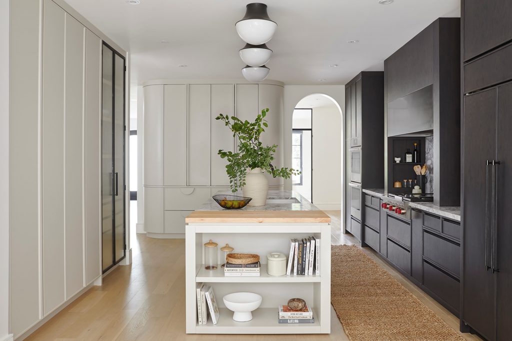
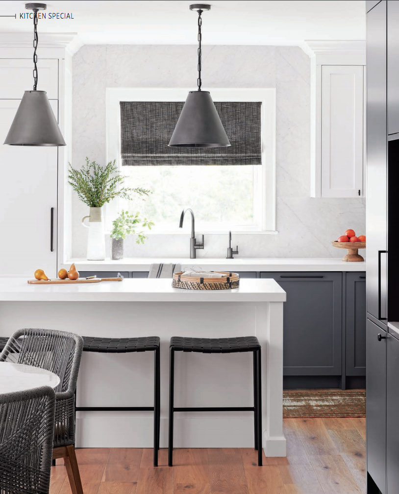
Like the house as a whole, the kitchen had a lot of positives for us to work with. It’s such a spacious room (especially by Toronto standards!), but the initial layout was not making the most of it. We immediately knew we would want to add more counter space and storage to make the kitchen more functional. The room also gets a lot of natural light, which we wanted to play up in order to keep it bright and airy. In the photo below you may notice that we actually eliminated a window (you can see light coming in behind the fridge in the before photo above!) but the glass cabinets flanking the range hood give the illusion of open space.
After
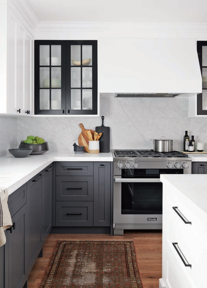
We went with a cool, neutral colour scheme that incorporated classic shades of grey, black, and white. We knew these colours would stand the test of time, but used them in unexpected ways to ensure that the room looks unique and current. For example, we opted to use all three colours on the cabinets, rather than just sticking to one.
Using a darker colour on the lower cabinets and a lighter one on top helped make the room feel more open and the ceilings seem higher. We love how the black cabinet doors frame the range hood and add a subtle pop of colour. The three paint colours we went with are Benjamin Moore’s Gray, Black, and Chantilly Lace.
The main colour palette was quite cool-toned, so we intentionally added warmth where possible. The wood floor adds a touch of rustic style, especially with the vintage-inspired rug. We also chose accessories with this in mind and opted for woven details, natural materials, and ceramics.
Adding in an island was a game-changer for this space. It’s a much better use of the area than the previous design and gives our clients plenty of counter space. We chose a Caesarstone countertop since it’s durable and easy to care for, and saved the high-maintenance marble for the backsplash (one of our pro-tips!).
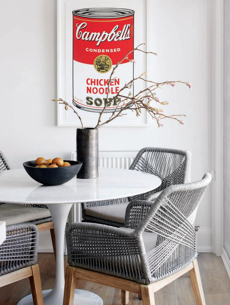
We love a round table in the kitchen because it feels both casual and intimate. Plus, you can often find round tables with just one leg, like this one, which allows them to take up much less space. Pairing the sleek table with woodsy, woven chairs was a perfect fit for this room – we fell in love with these ones from Wayfair. We’re big fans of food-inspired prints, and this Campbell’s Soup one is a classic!
We’re obsessed with how this kitchen turned out – from the photos, it doesn’t even look like the same room. Stay tuned for more Before + After posts – don’t forget to let us know which project you want to see next in the comments!